
Intro
The project delves into the redesigning a book(s) that responds to the text, the author, the reader, and design (as a cultural activity) according to given specifications of layout, typography, format, packaging, paper, cover and etc.
Solution
The final book redesign, provided a cleaner and minimal tone to the cover and organization of content within the book. Amplifying the images (as it is a collection of essays about art) helped in understanding the context of each topic and referenced image. It allowed for more free space that enhanced readability and legibility of the information.
Initial Analysis
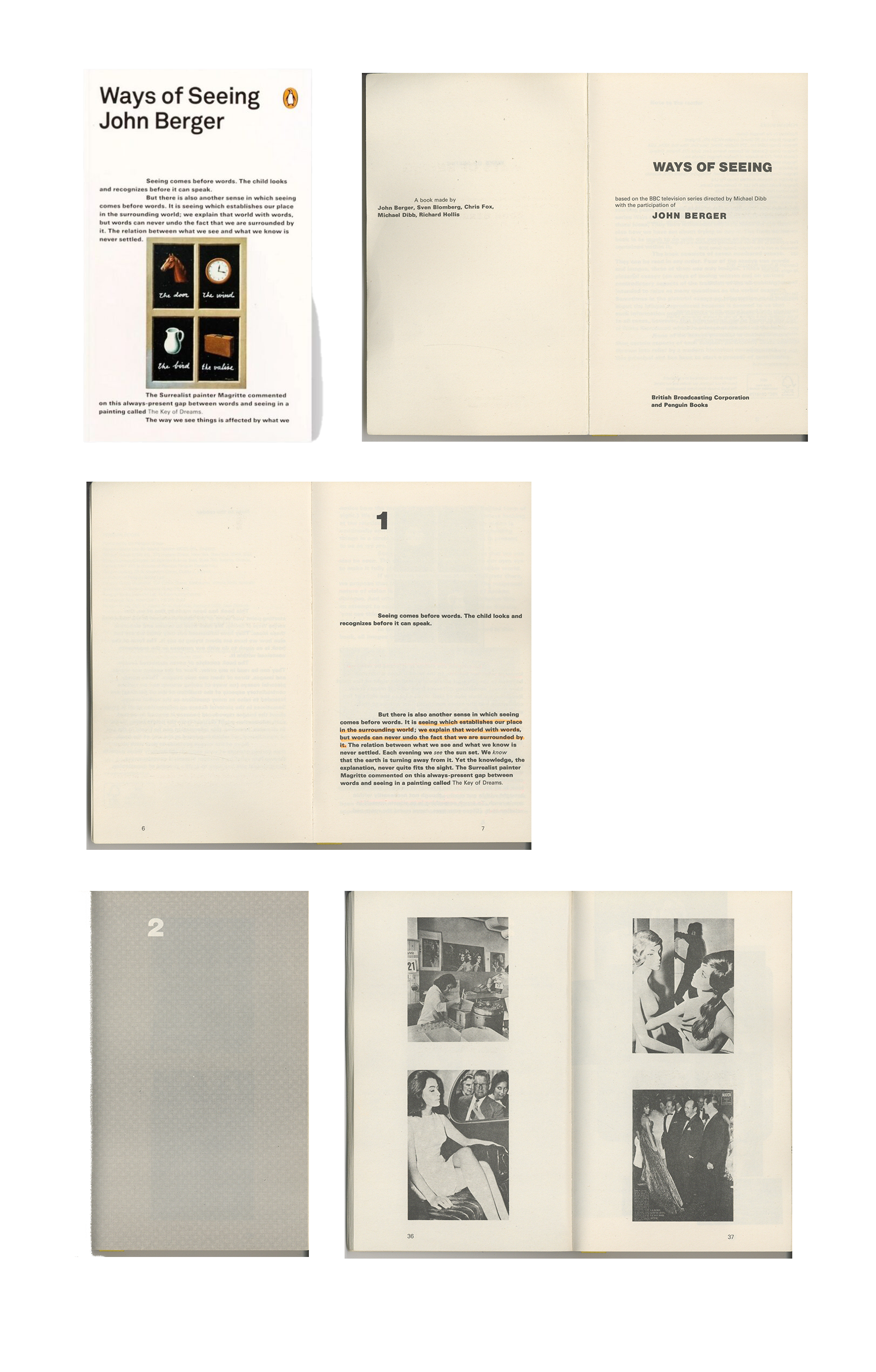
The original cover design was commissioned to be made by Richard Hollis. YES, a company who was inspired by Hollis’ design adjusted some of the layout but applied the similar visual from Magritte’s work and a preview of the text content on the cover in the reissued edition. The chapters are separated interchangeably with a verbal essay and a pictorial essay.
The overall composition of the book is tight and constrained—given that the body text has bold weight. The indentation of each paragraph seems a bit jarring instead of providing a good pacing for the reader
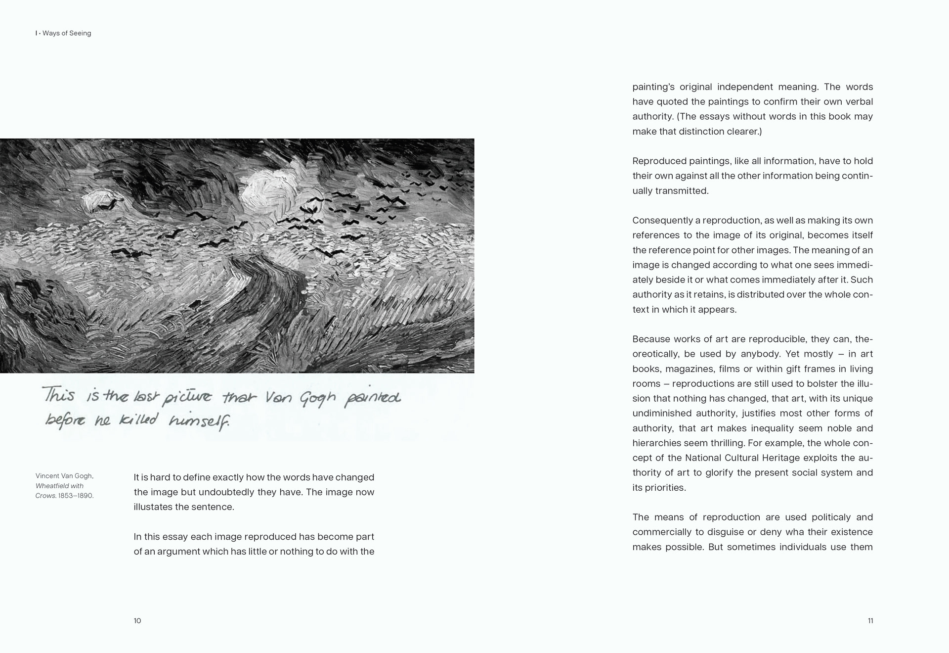
The captions is not always subtle and distracts the reader because of its placement and orientation with the image and the body text.
The overall composition of the book is tight and constrained—given that the body text has bold weight. The indentation of each paragraph seems a bit jarring instead of providing a good pacing for the reader
The captions is not always subtle and distracts the reader because of its placement and orientation with the image and the body text.
Layout
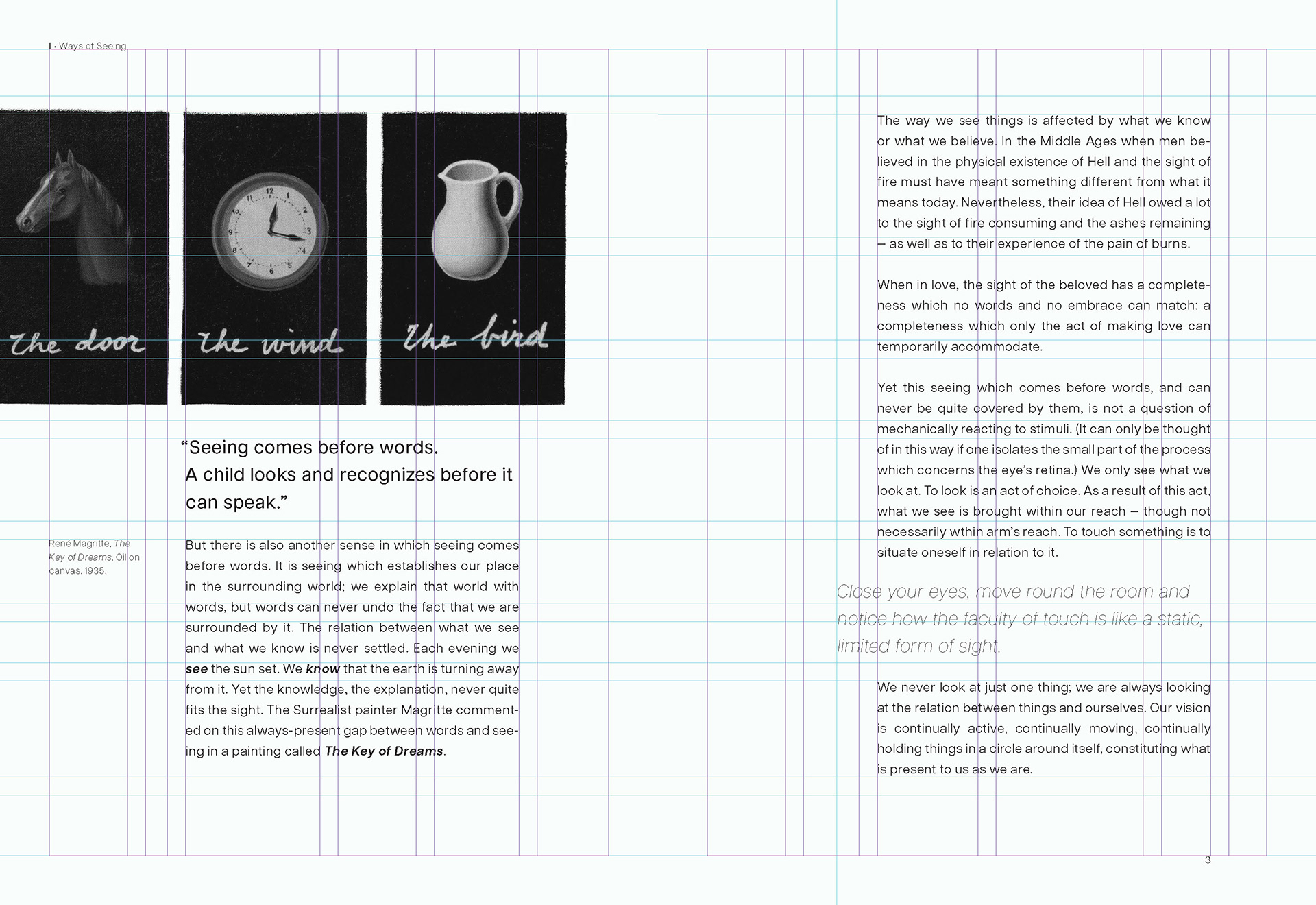
The planned layout for the redesign involved a modern layout composition showing a clean and balance integration of text and image making use of the white space to provide more breathing room for each spread—resulting to increasing the size of the book to achieve a seamless and easy reading experience for the user.
Typeface Specifications
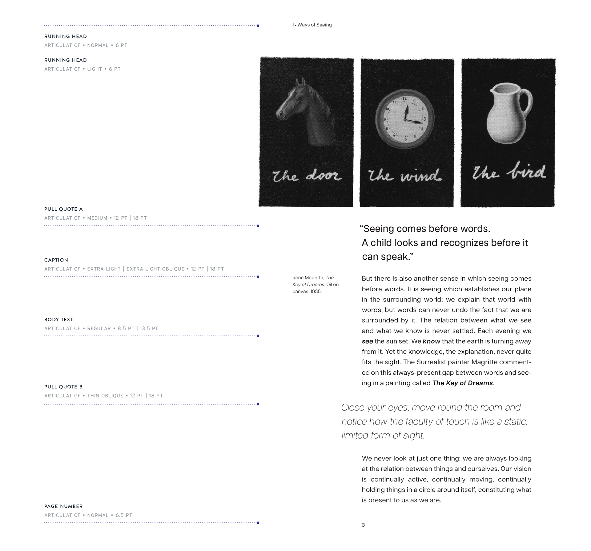
The chosen typeface for the final redesign is Articulat CF, a sans-serif typeface (Adobe Fonts) that provides a wide space for each character without sacrificing the legibility of the text. With proper leading and weight for each type of text, information can be read easily as reader moves to the next page and so.
(Below are some of the more specific changes and updates made for finalizing the book redesign)
(Below are some of the more specific changes and updates made for finalizing the book redesign)
Chapters + Spreads
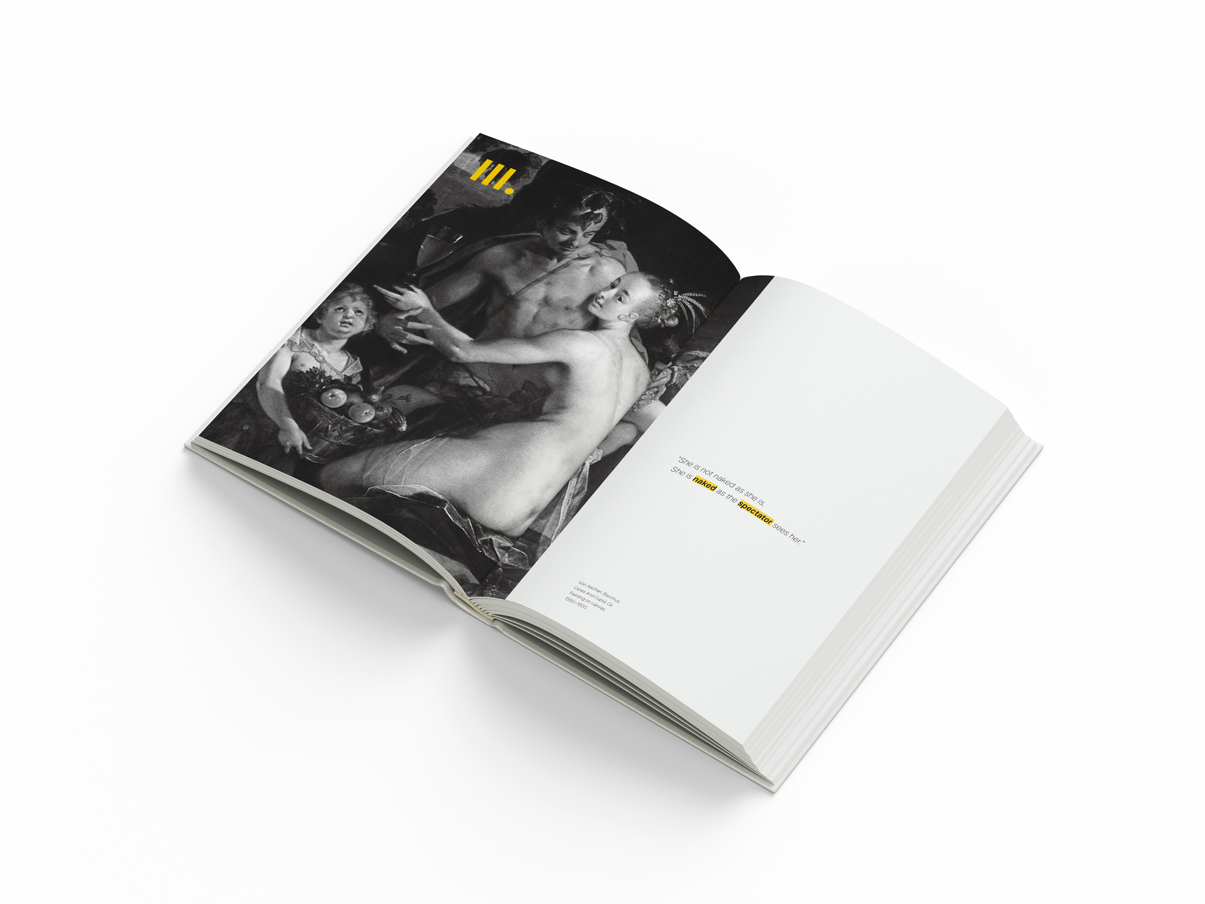
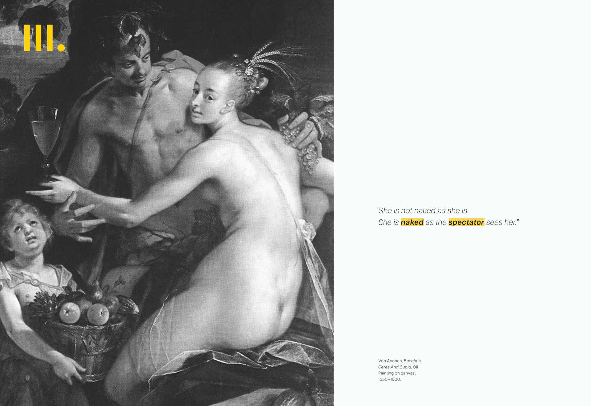
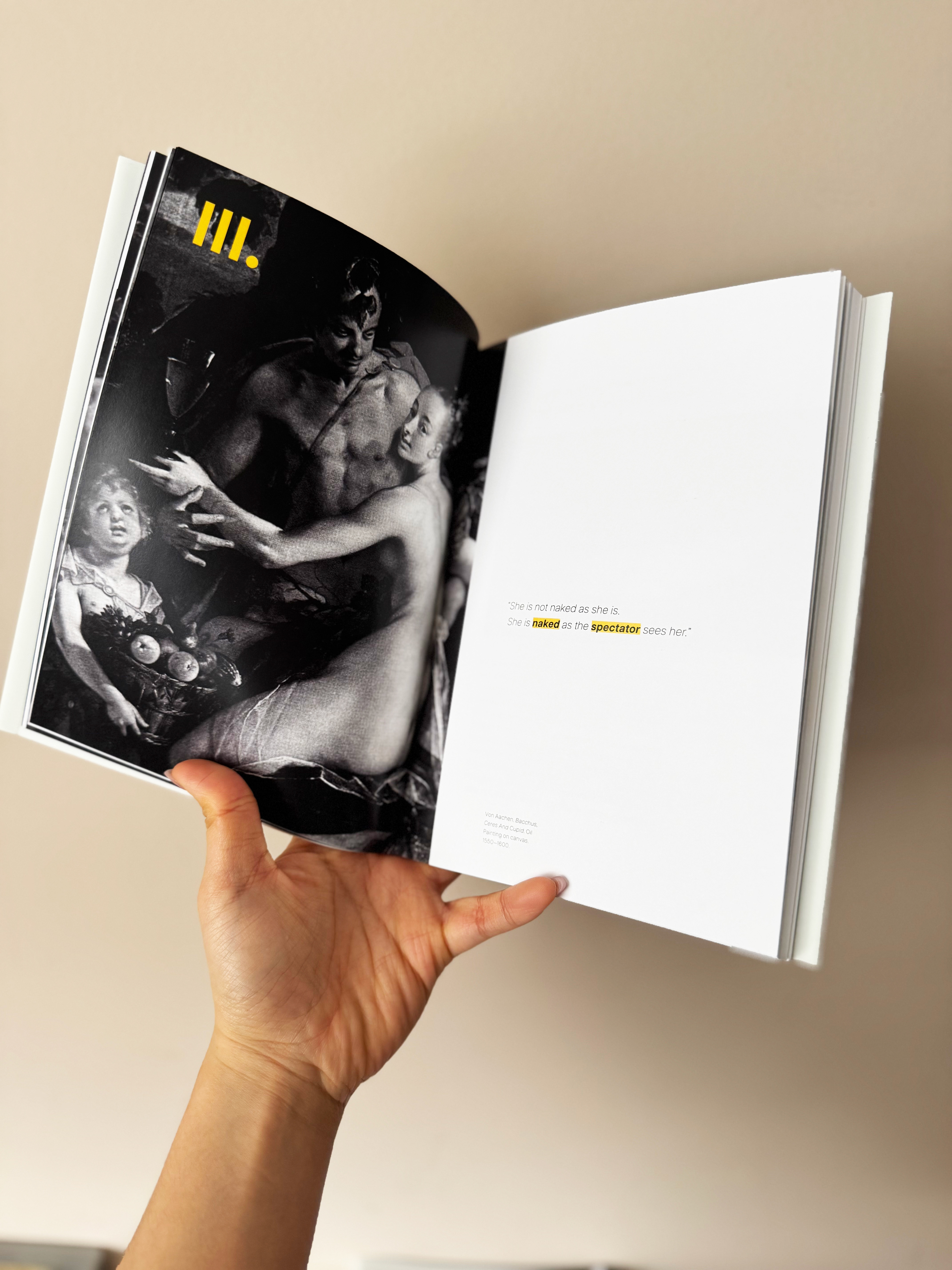
The introduction of new chapters have been redesigned to feature an image and a quote from the sections that had essays. Sections that only show images made use of the white space to create more dynamic layouts (bleeding some of the images of the page borders).
Placement of captions are either placed within the margins on the sides of the body text or aligned together without overpowering the main focus of the spread.
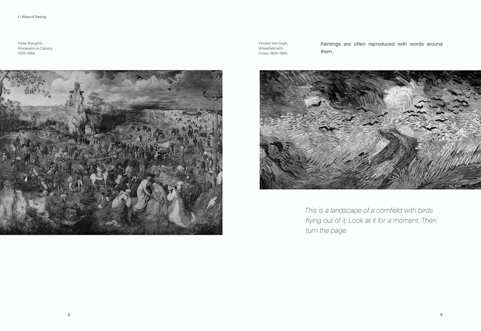
Some information were also re-organized in the redesigned spreads to provide more impact to what John Berger (author) wants to drive home for the readers of the essay, placing text and image conveniently to allude to what message Berger wants to deliver. This also gives the readers a good pacing to fully understand and absorb the text which the original mass market copy jam-packed into each page.
Some information were also re-organized in the redesigned spreads to provide more impact to what John Berger (author) wants to drive home for the readers of the essay, placing text and image conveniently to allude to what message Berger wants to deliver. This also gives the readers a good pacing to fully understand and absorb the text which the original mass market copy jam-packed into each page.
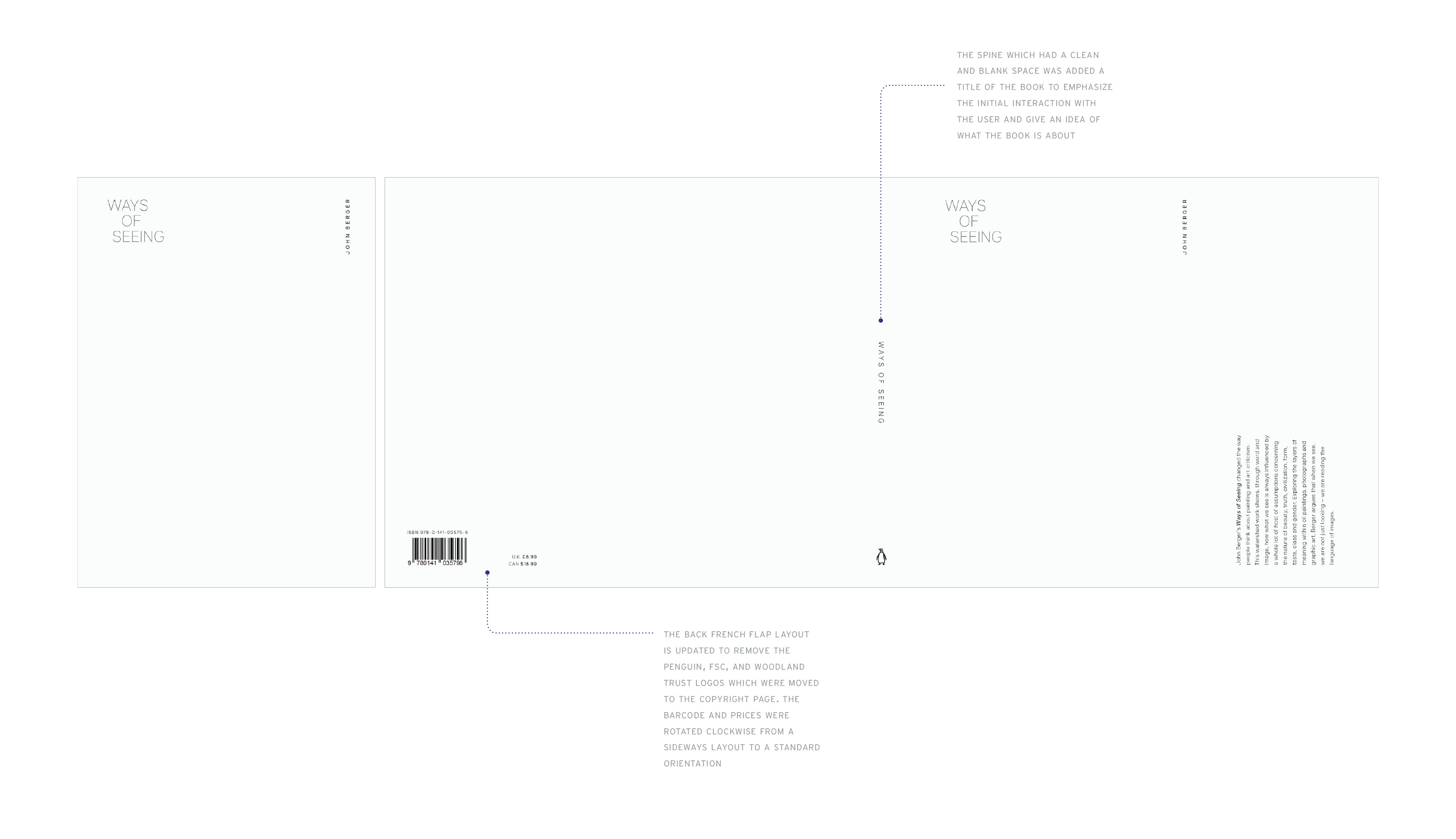
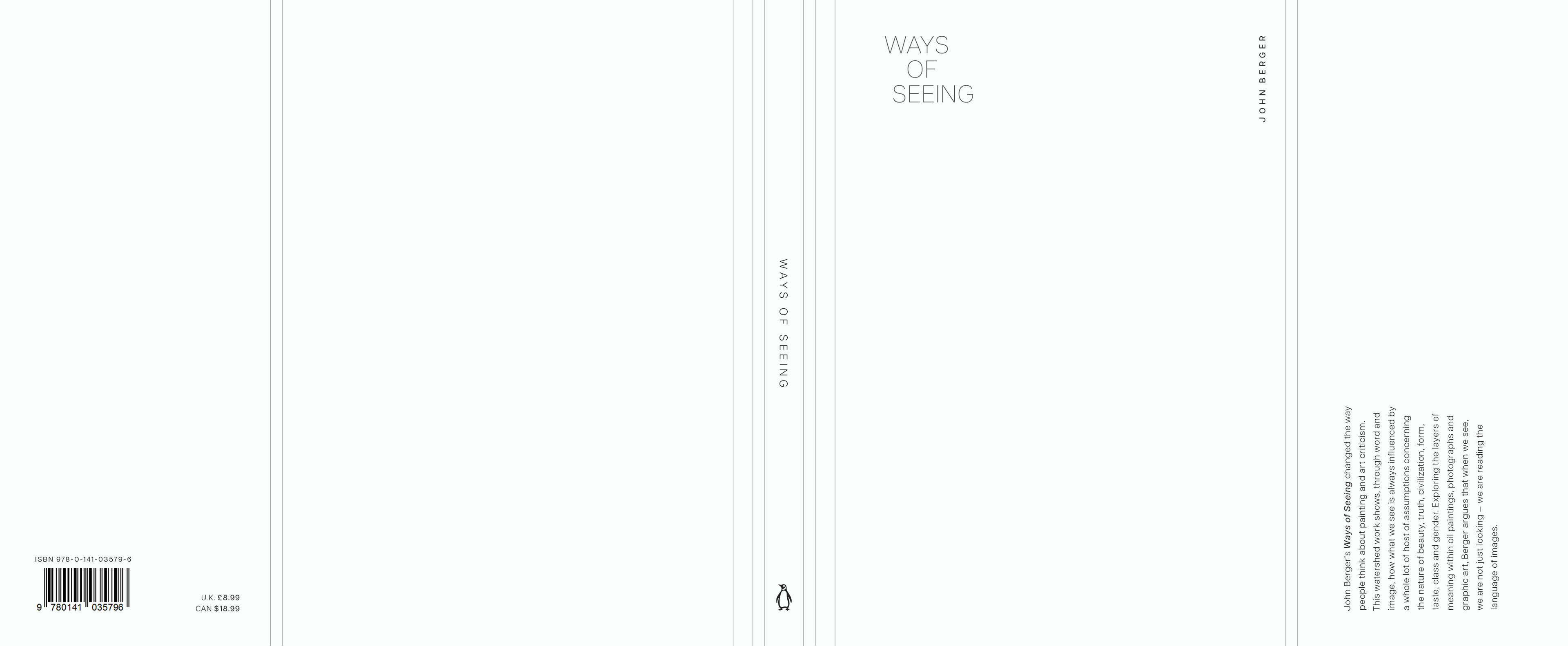
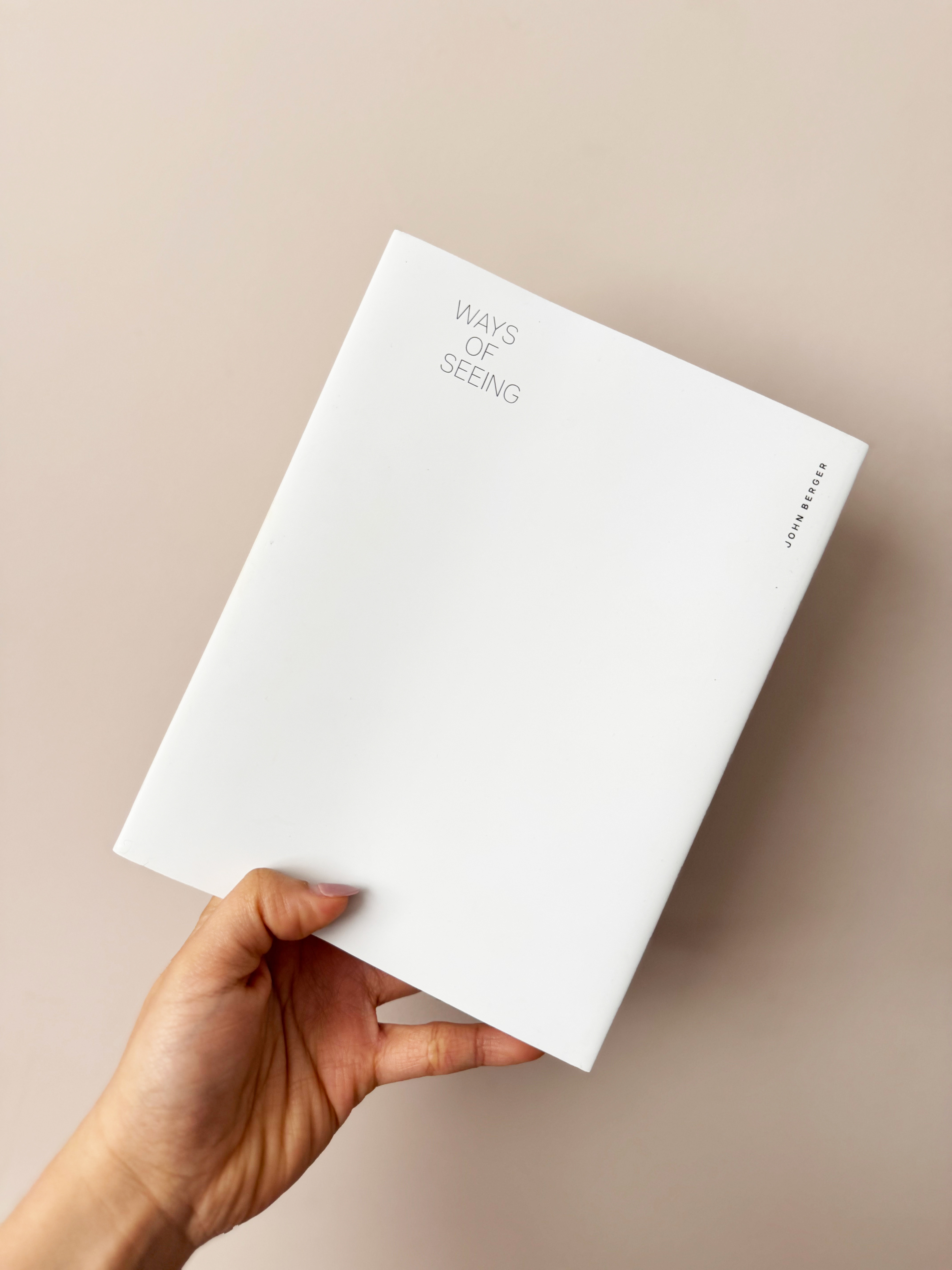
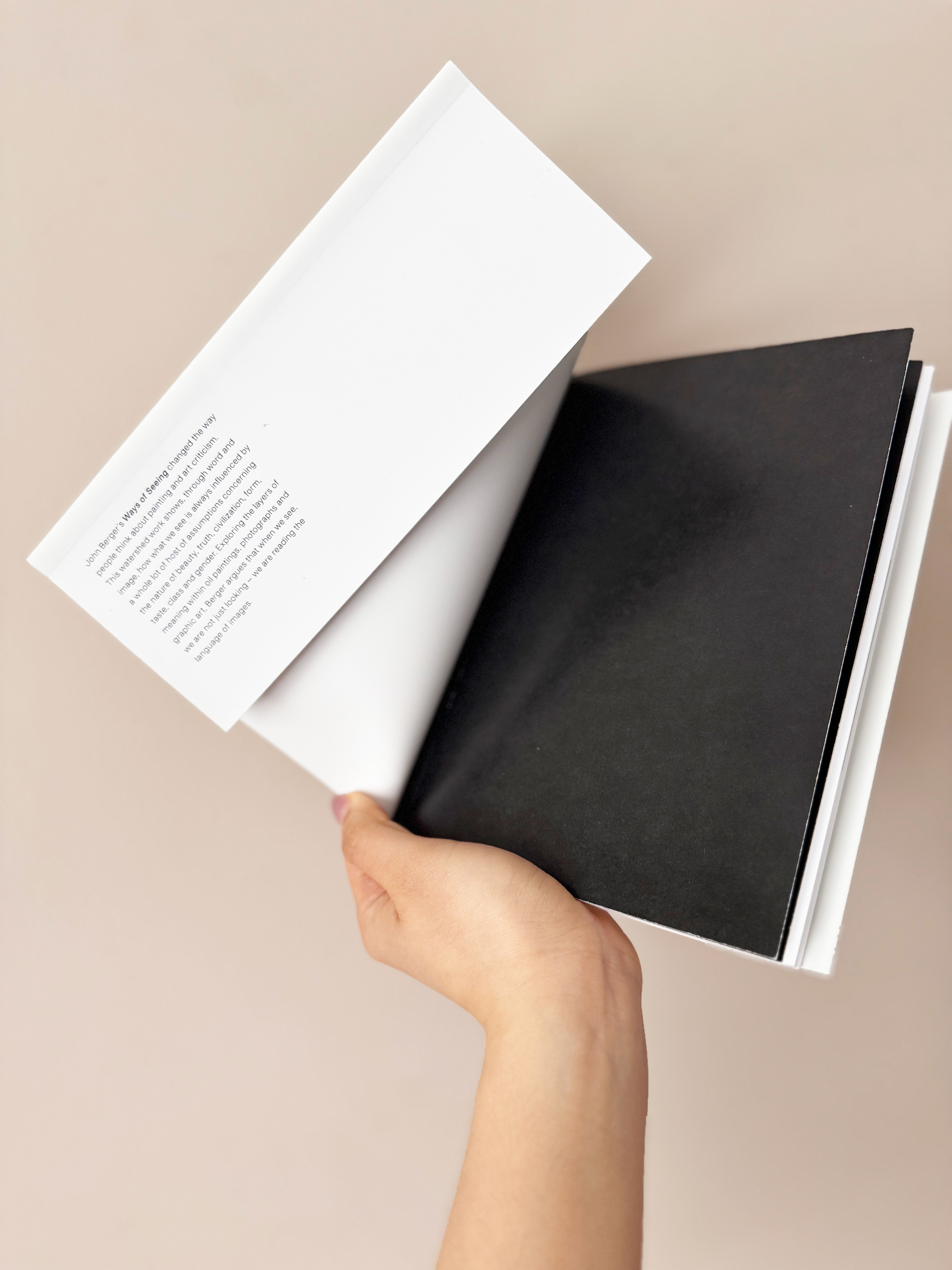
Cover
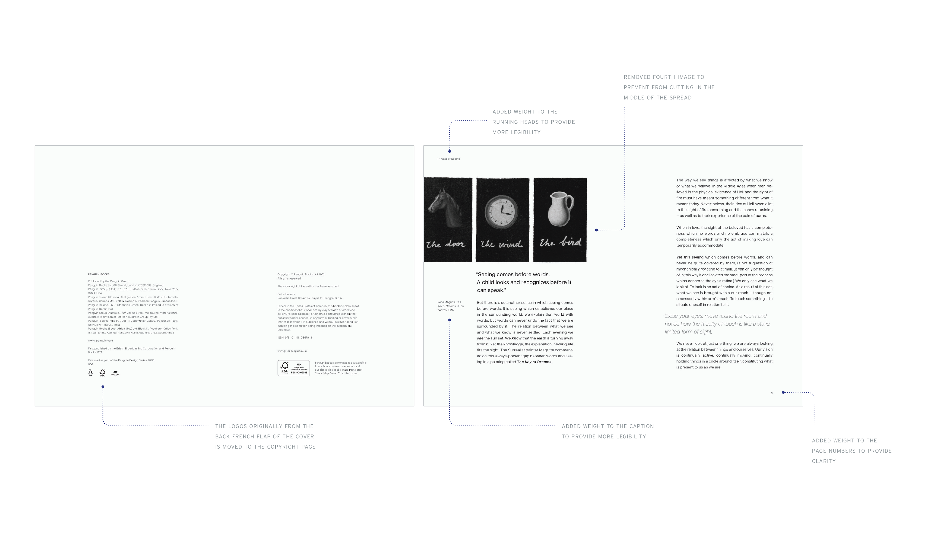
The full cover is redesigned to have French flaps and using those spaces to add the blurb at the front flap and the sample barcode and pricing at the back flap. I wanted to make it different and minimal compared to the typical back cover blurb with the inclusion of testimonials.
I also opted to use a minimal layout for the whole cover to provide a more professional tone but also contrast the cover to the dynamic layout and amount of elements the interior pages offer.
I also opted to use a minimal layout for the whole cover to provide a more professional tone but also contrast the cover to the dynamic layout and amount of elements the interior pages offer.
(Below is the the cover spread connected as a jacket cover and this is also how I printed it with guidelines for me to know where to crease and fold)
The project provided me with the ability to analyze large pieces of information and how to organize and layout elements that go together in each spread. It also made me understand how user behaviour works, in terms of how readers are able to read the text seamlessly without a lot of distractions and with enough pauses. The manipulation of blank space help in the natural flow to the user experience but also allow me the creative freedom to experiment with dynamic layouts without compromising legibility and the reading experience for the user.
Ways of Seeing
BOOK REDESIGN | Ways of Seeing by John Berger
Programs used: Adobe InDesign | Adobe Photoshop