Intro
The University of Alberta’s Department of Art and Design required an identity that should reflect it as part of a world class institution where their students are strategic thinkers, innovators and skilled in their respective craft. To be shown in the upcoming Open House, the identity should allude to the flexibility in the path that students can take (interdisciplinary) in their art and design programs.
Solution
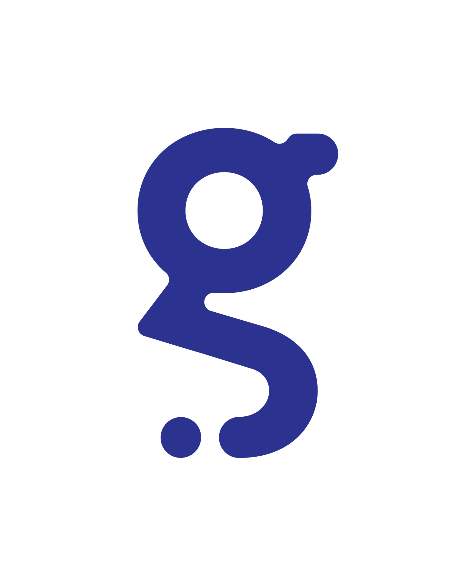
The proposed logo took in rudimentary and geometric forms to allude to the importance of creating foundations and roots to foster growth and engage minds.
Cut from a circle, the fragments became the letterforms that reflect the Art + Design Department as part of a whole. These pieces also take on numerous shapes mirroring the possibilities and flexibility to forge new paths for the future
Variations
The proposed logo can be shown in horizontal, vertical, and stacked (see identity guidelines below) versions with the main standard colours from the palette
Scale
The identity was scaled to test logo legibility and recognizability at a small and massive size.
Colours
The colours include a mix of bright and dark hues. It reflects an engaging and fresh tone to the identity. Most are incorporated in each letter or can be used as a single colour for the identity. .
Typography
The typeface Martian Mono is mainly used for the name and tagline of the identity. The typeface created a contrast from the wide and thick forms of the main in identity.
Applications
The following images employ the use of the identity through many applications and formats. From website banners, social media posts, to physical posters, banners, name tags and merchandise.
Social Media + Website Banners
The social media applications (above) include: website banners, instagram posts and stories. The use of the identity into numerous ways that emphasizes its dynamism and flexibility, not only as a concept but how it is placed within different social media platforms—engaging the youth to be curious and to allow possibilities to grow.
Posters + Banners
Both posters and banners featured the expansion of the identity to work as a system through the integration of patterns reflecting pathways, our roots, and growth either as a design that can be placed as a series continuing on to the next poster, or one that can stand alone—featuring a solid colour background from the original identity colours, or overlaying photographs: both archival (taken during the previous years in the University) or contemporary works and events surrounding the Art + Design Department through the years.
The posters (above) acts in a functional way that can also be used as an informational device providing upcoming students with the list of programs under the department, requirements for admission and its procedures.
The posters (above) acts in a functional way that can also be used as an informational device providing upcoming students with the list of programs under the department, requirements for admission and its procedures.
Name Tags
The name tag design feature two samples of design that alternate between using the pattern formed from the letterforms of the identity, reflecting the continuity and the concept of pathways of the identity system.
The second design emphasizes the identity itself through magnifying it within the composition, creating a simple, yet effective way to capture visual interest due to the dominating colours applied in the system.
The second design emphasizes the identity itself through magnifying it within the composition, creating a simple, yet effective way to capture visual interest due to the dominating colours applied in the system.
Merch (Swag)
The proposed swag includes, a tote bag, a bucket hat, and a mug. Objects are chosen because of their constant usability and appeal to a mix of audiences, making the identity accessible a large range of users.
The project trained me to create and understand working systems that apply to every part of the application of the brand. Attention to detail and the understanding of how a visual identity should be consistent yet evolving into a variety of ways, made me realize that I am a designer that is not afraid of big ideas, transforming many approaches to find ways on how to innovate a logo that stays cohesive and dynamic in a multitude of variations that could stand the test of time.
Department of Art + Design
BRAND IDENTITY GUIDELINES
BRAND IDENTITY GUIDELINES
Programs used: Adobe InDesign | Adobe Illustrator | Adobe Photoshop
