
Intro
For this project, we were tasked to choose a piece of writing (music or poetry) that can be expressed through typography in a variety of ways—focusing on how one would see, read, and understand text.
Solution
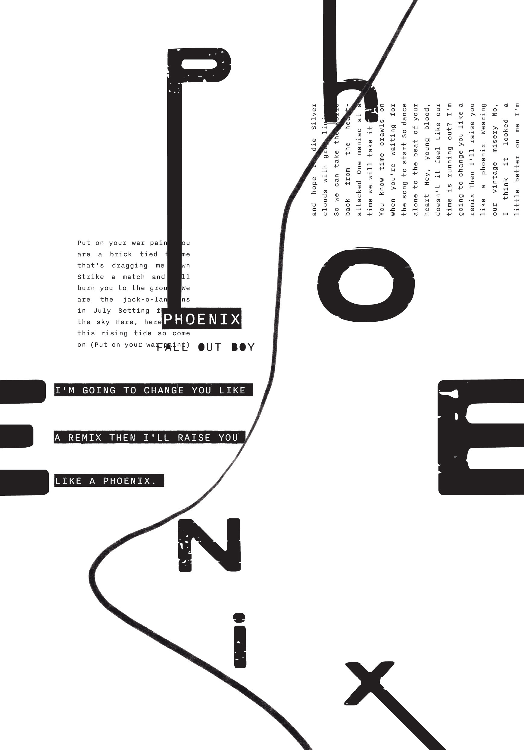
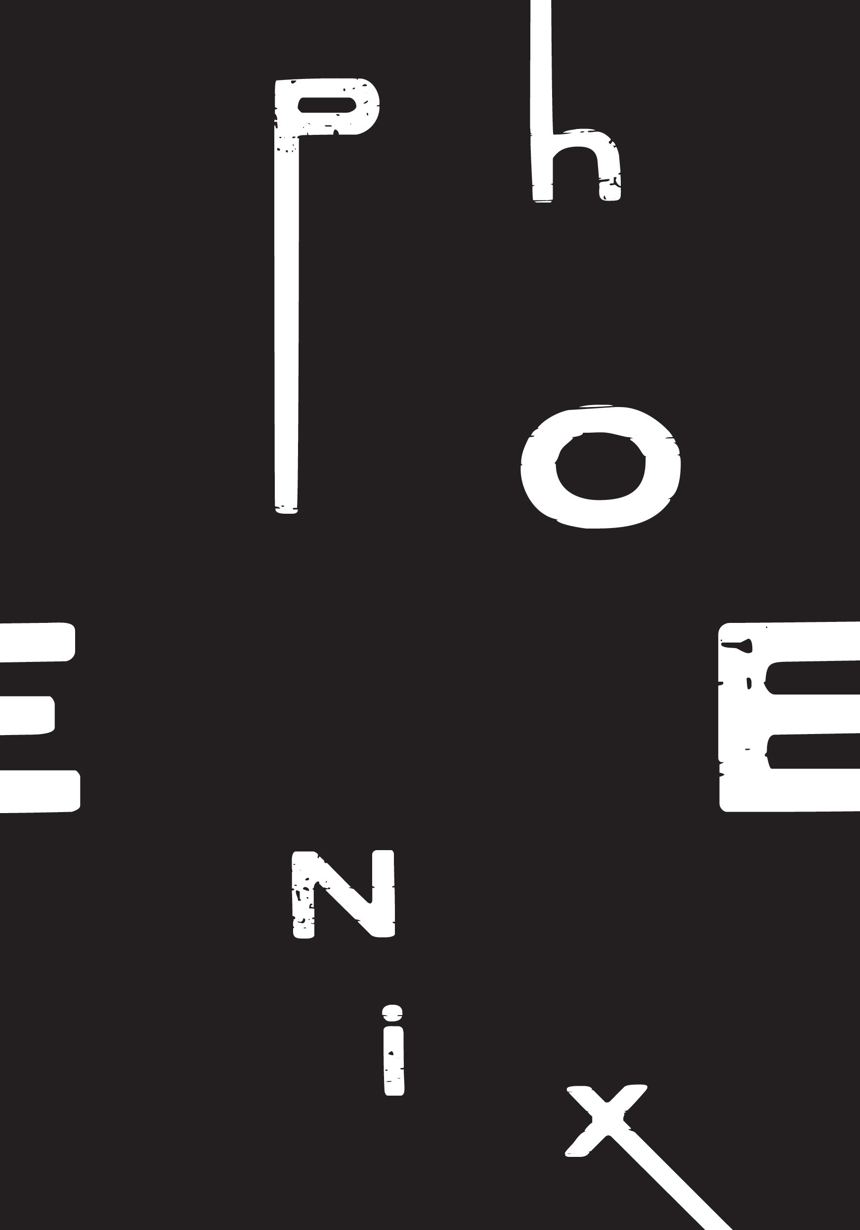
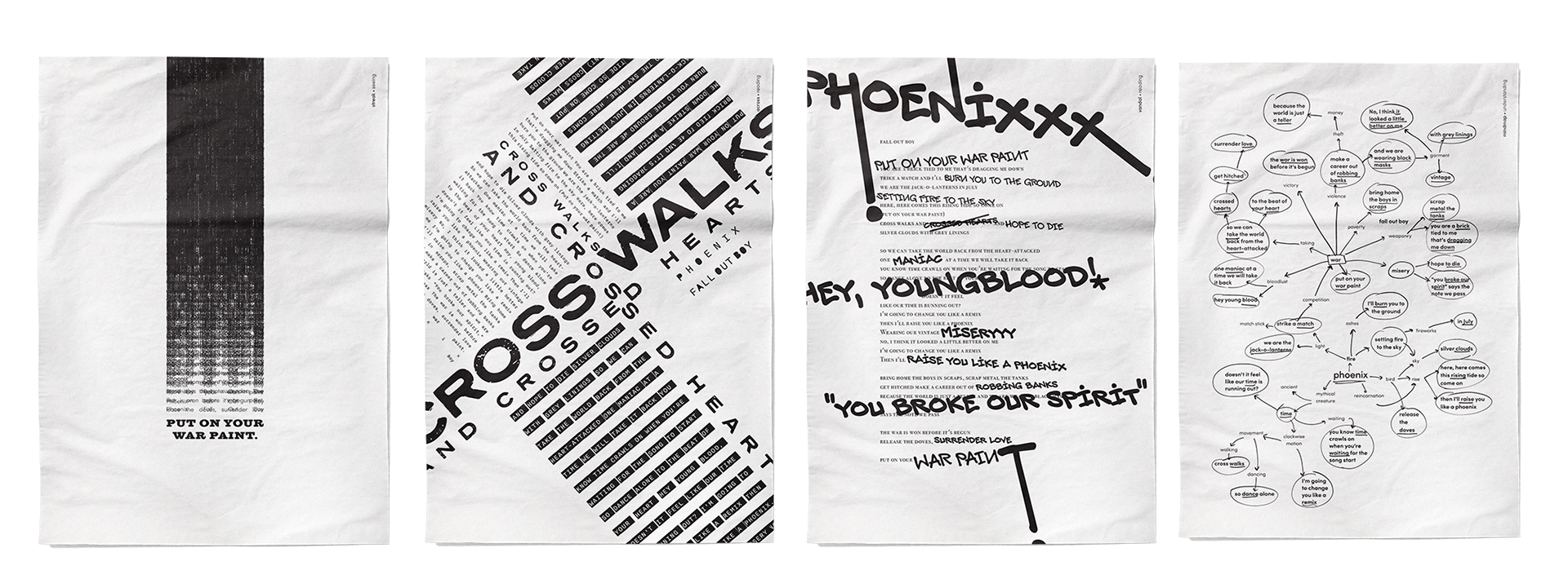
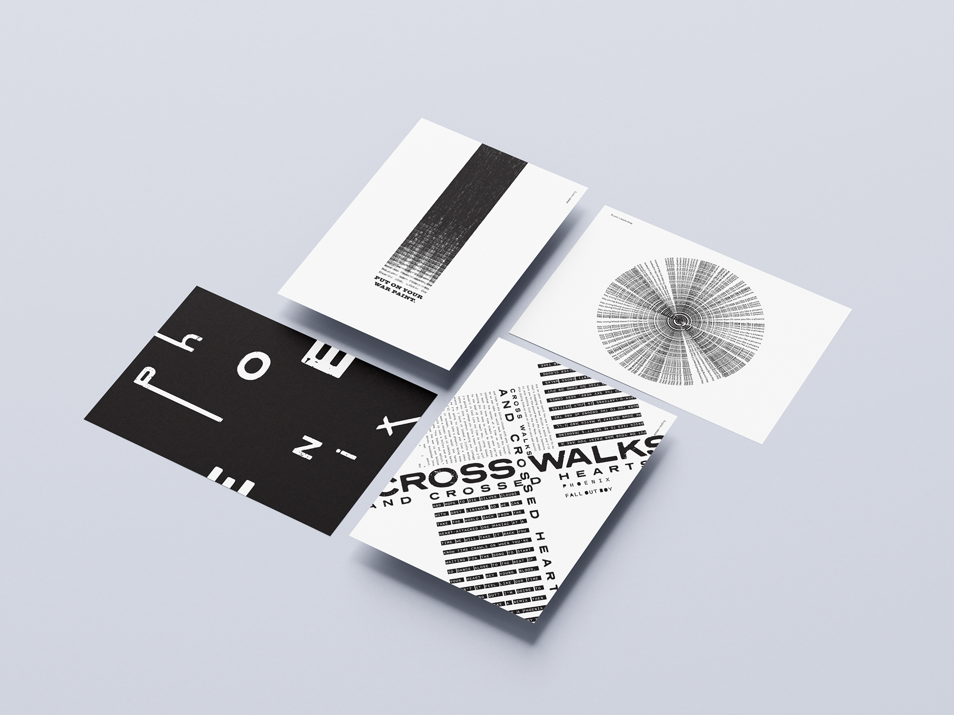
The final pieces highlight the song Phoenix by Fall Out Boy. Themes that resonate with the song evoke extreme emotion, a revolt, an angst against something but also the sense of rising above and awakening from hardships that one had been experiencing it all.
Using text to create texture and applying meanings of text to work with the structure of the composition helped in the variety ways one can express the lyrics through typography.
Using text to create texture and applying meanings of text to work with the structure of the composition helped in the variety ways one can express the lyrics through typography.
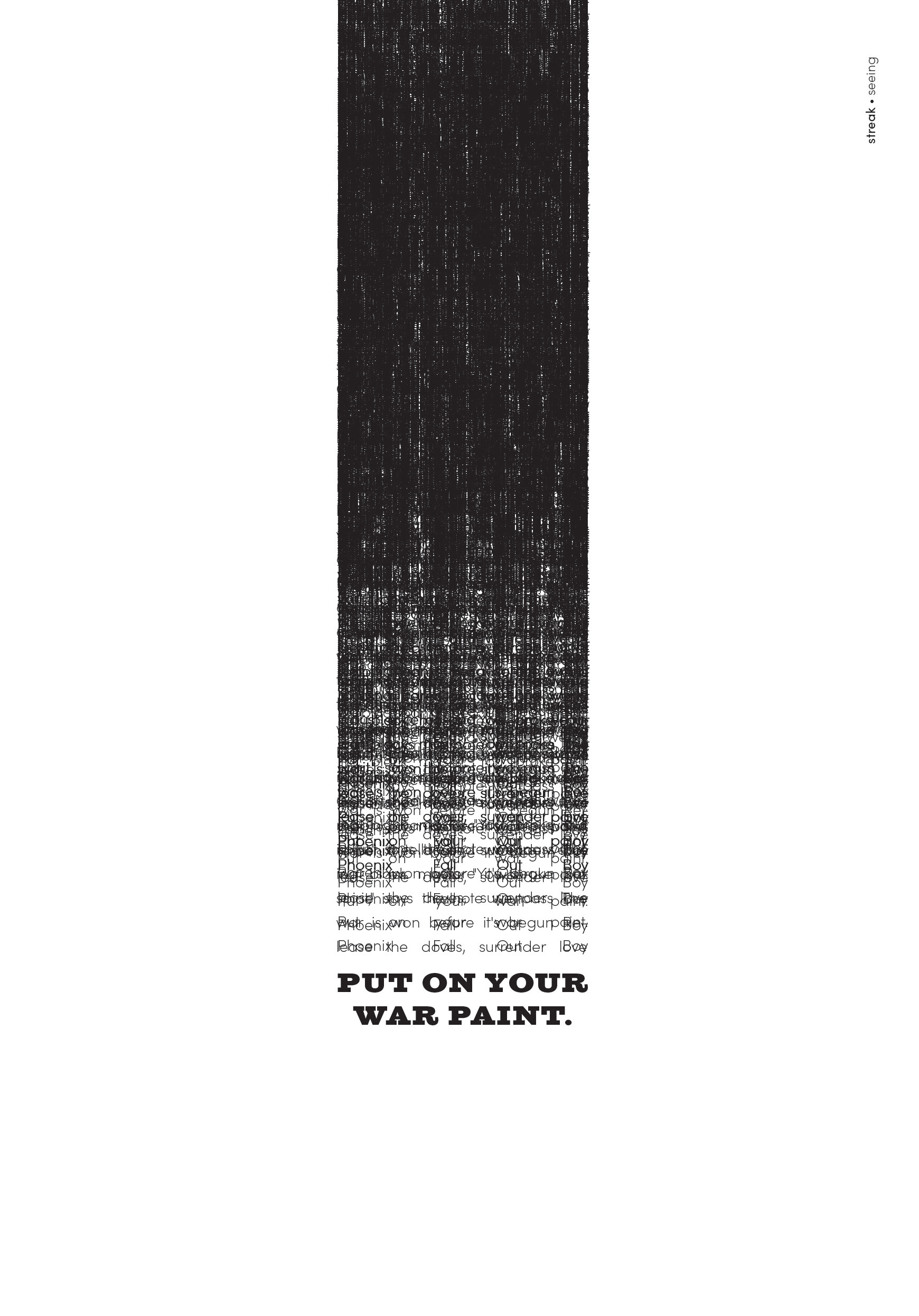
Seeing
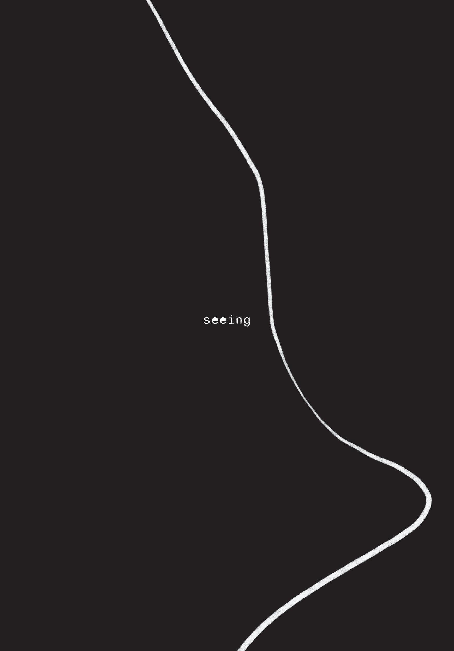
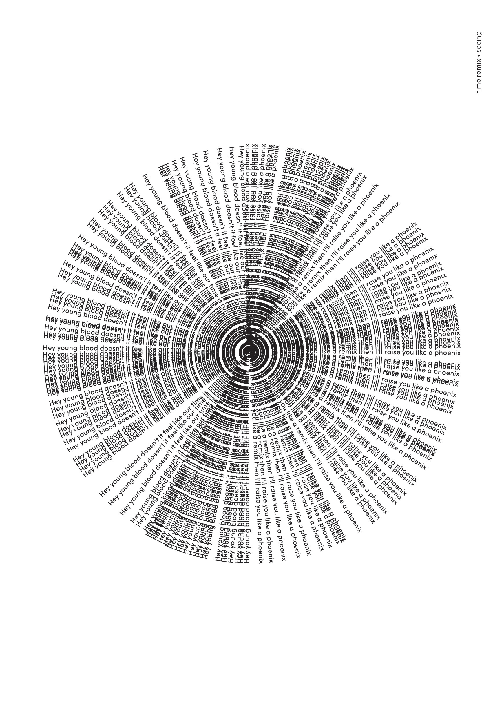
Divided into three categories: seeing, reading, and understanding, the first section delves into how the text can be interpreted through visual images.
I aimed for creating visual focal points for each piece on this section to grab the attention of the viewer as the text can exemplify tactile objects that they are familiar with—either using overlaid text to create texture or emulating forms of objects in everyday life.
I aimed for creating visual focal points for each piece on this section to grab the attention of the viewer as the text can exemplify tactile objects that they are familiar with—either using overlaid text to create texture or emulating forms of objects in everyday life.
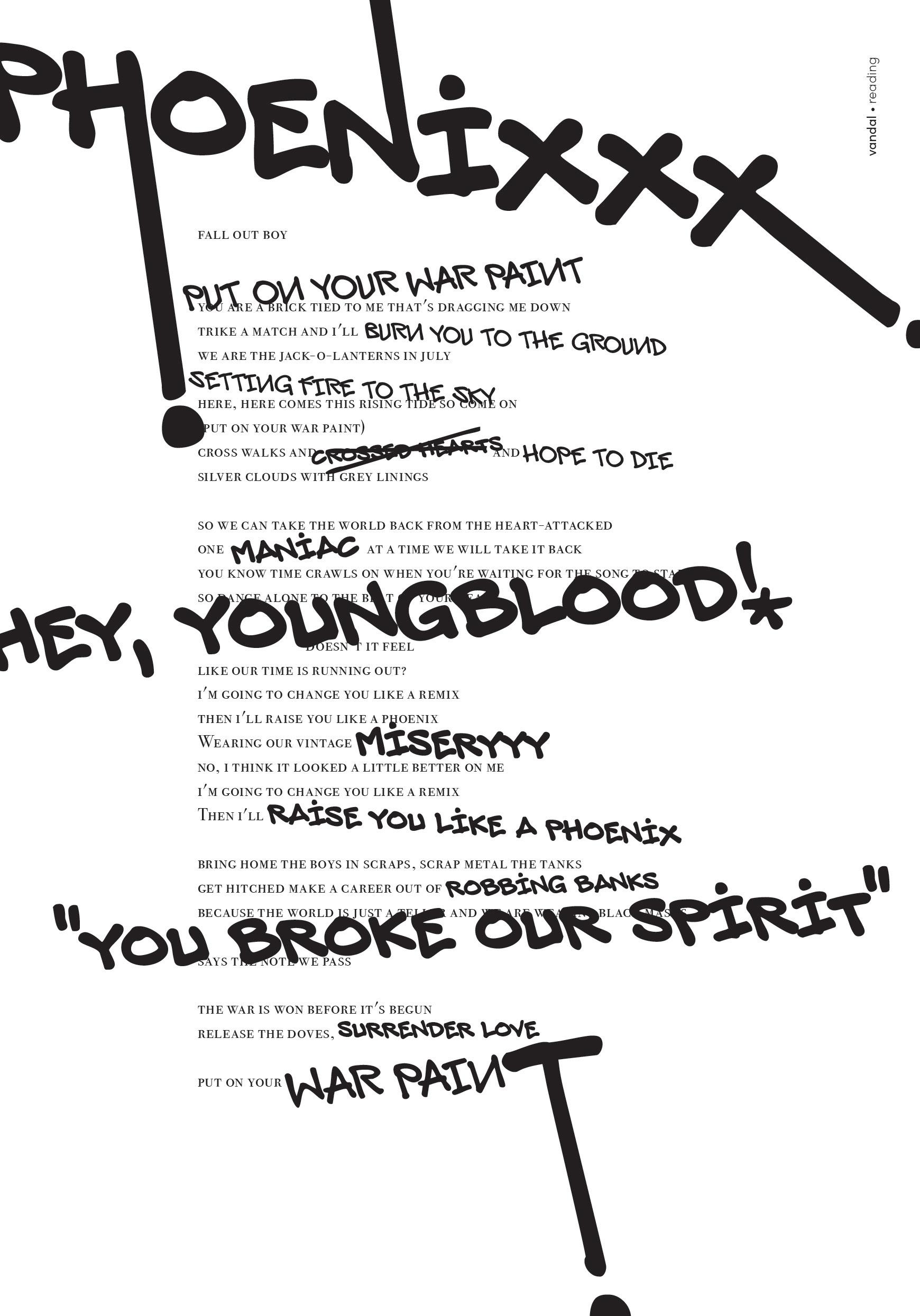
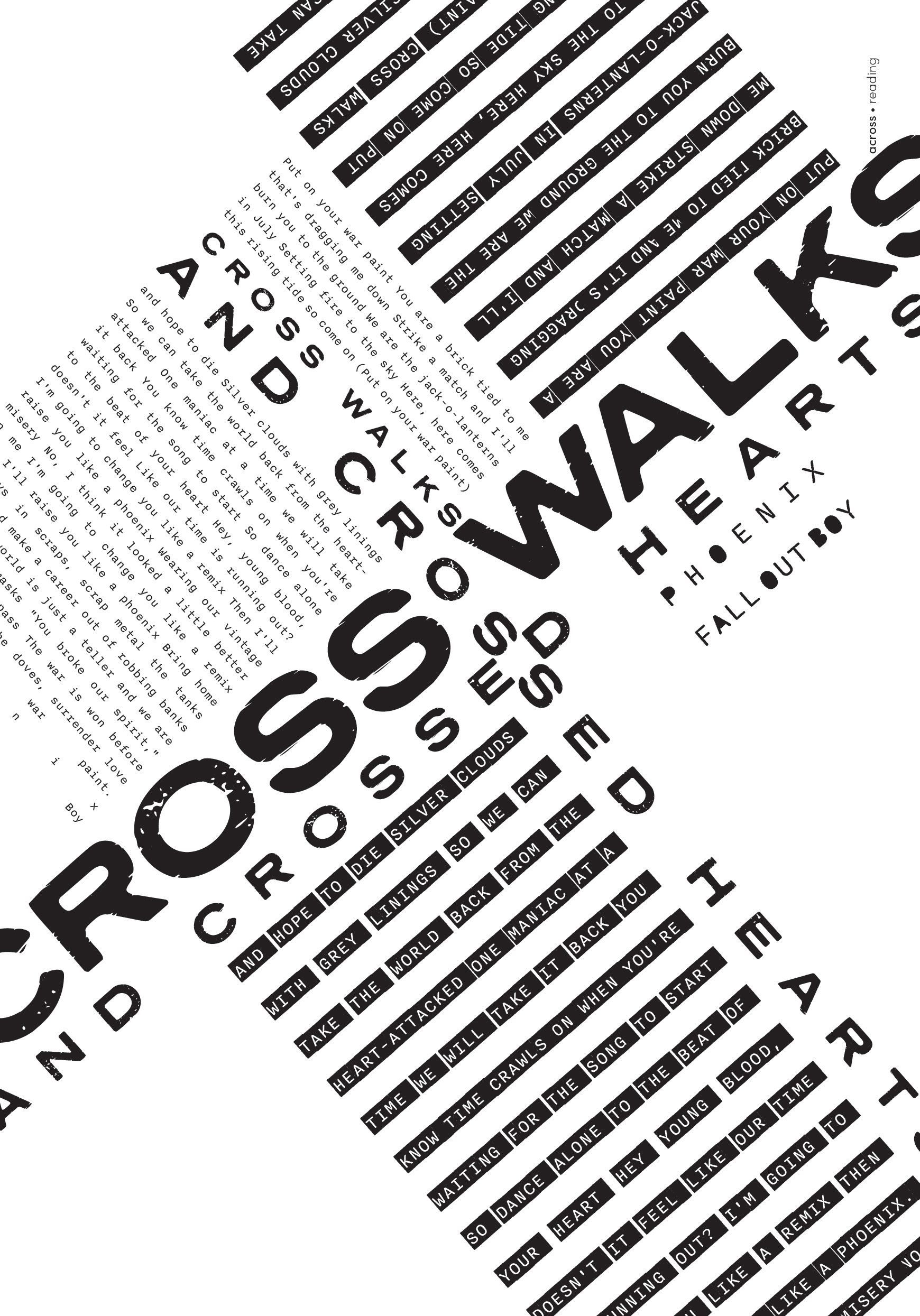
Reading
The second section aims to interpret text through the many ways it can be read. I have highlighted certain keywords within the lyrics that can provide impact on each piece and reflect how the text can be shown through other mediums like a flyer, court transcript, bank statement, and etc., where one would usually read these kinds of documents.
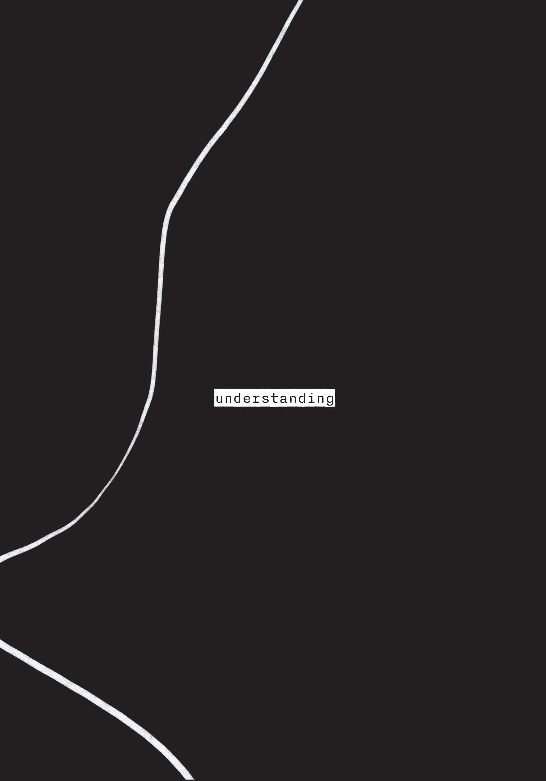
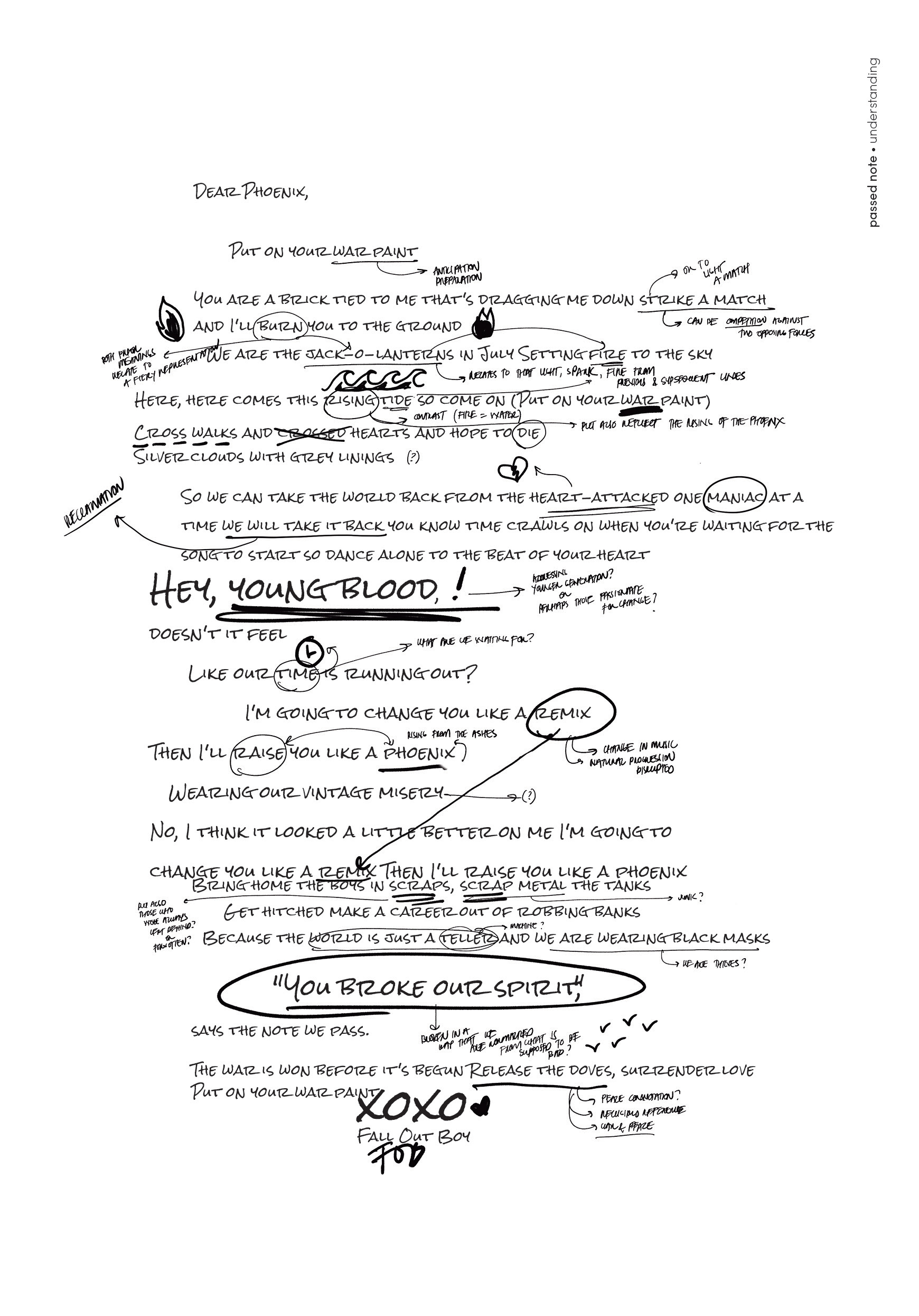
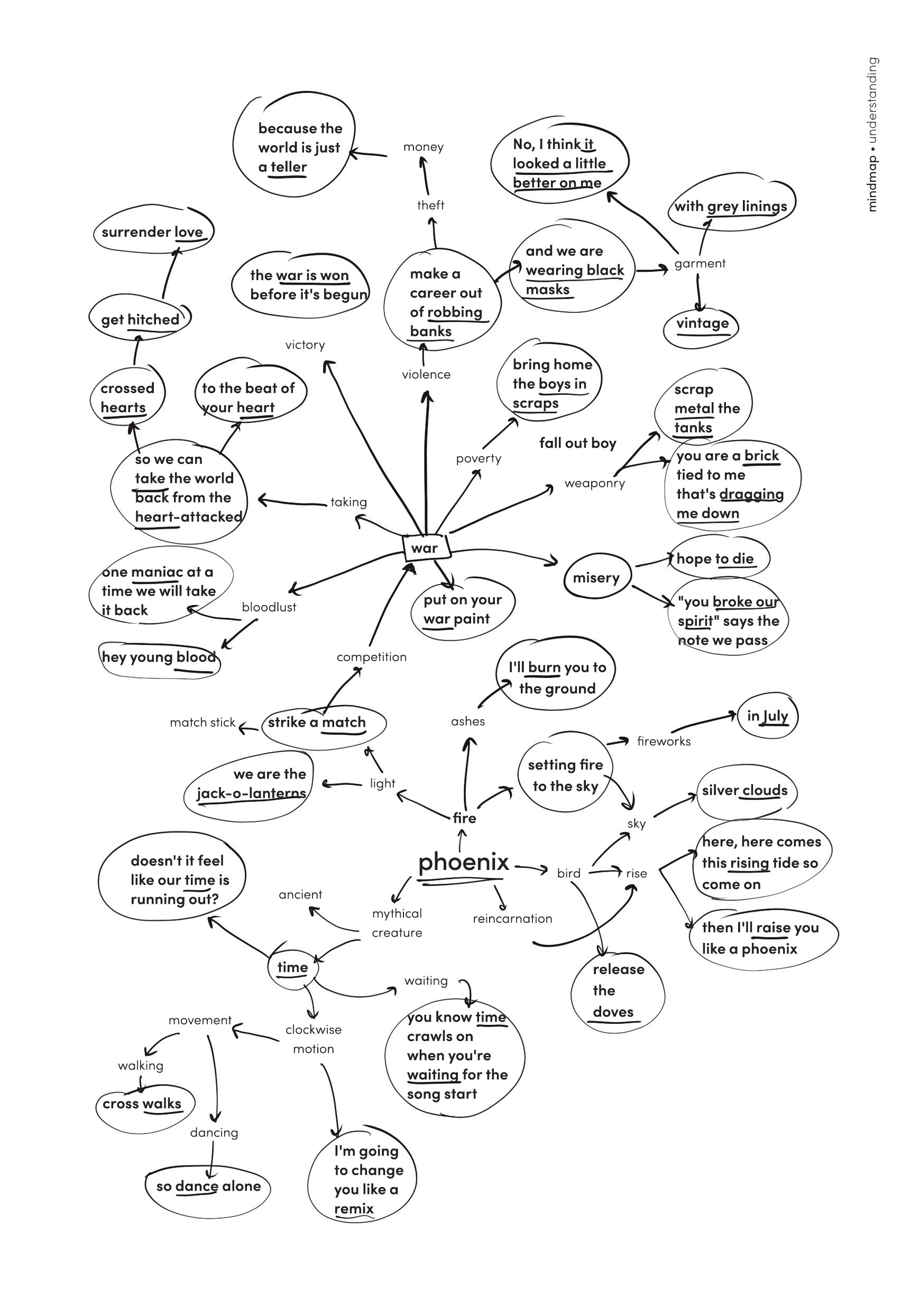
Understanding
In the final section, I have delved deeper into analyzing the text in various ways—by annotating, creating a mind map by using all the words of the song, numbering words starting with each letter of the title, displaying the text in a different language, and etc.
The cards are printed in a scale less than an A4 size paper and in light tan paper showing each interpretation of the text on one side, and on the other would be the typefaces employed on each piece including the type size and leading.
The project enhanced my attention to detail and being open-minded to experimentation and exploration of layouts and compositions. Most of all, it helped me to be able to express emotions, underlying meanings from text into visual narratives and to allow to expand creativity beyond to what we can see, read and understand and think out of the box to interpret a given text through expressive typography. The project formed my interest not only in typography but also in the publication and editorial design industry and appreciating layout design.
Phoenix
LYRIC EXPRESSIVE TYPOGRAPHY
Programs used: Adobe InDesign | Adobe Illustrator | Adobe Photoshop | Procreate