Intro
The project delves into how the logo would define and express a transition alluding to the experiences, motivations, and ideals of the University of Alberta's design graduating class of 2023—2024
Solution
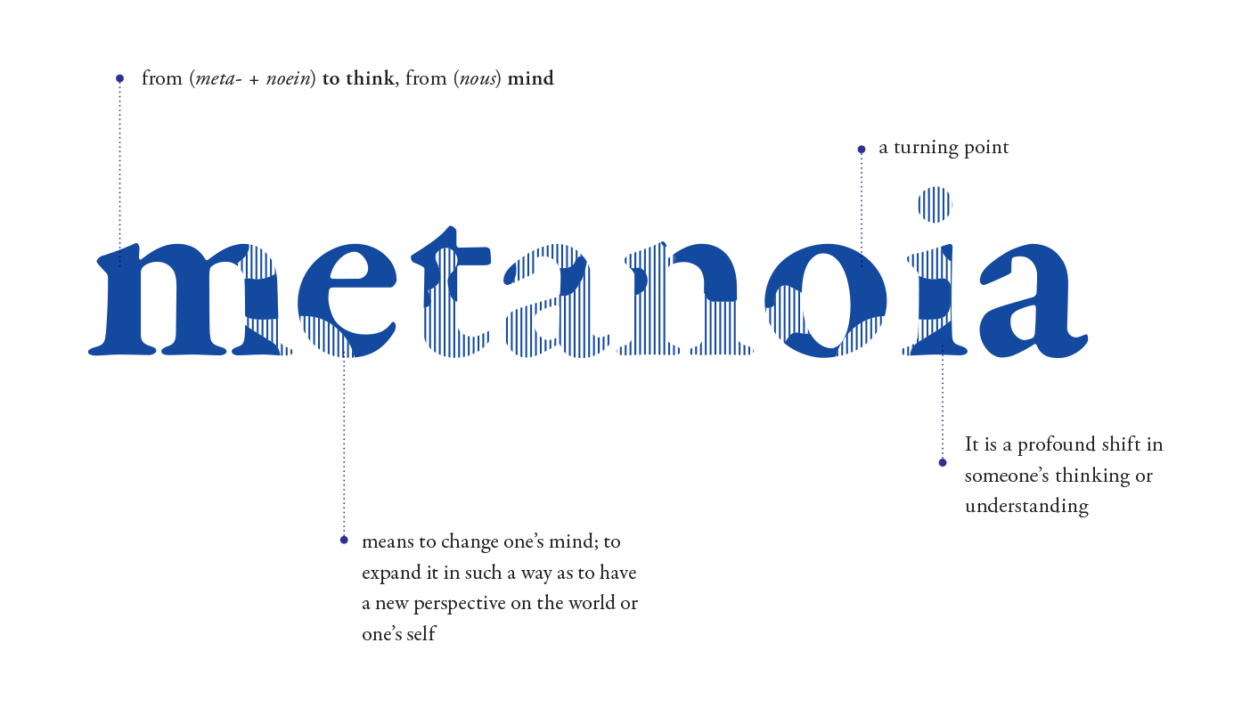
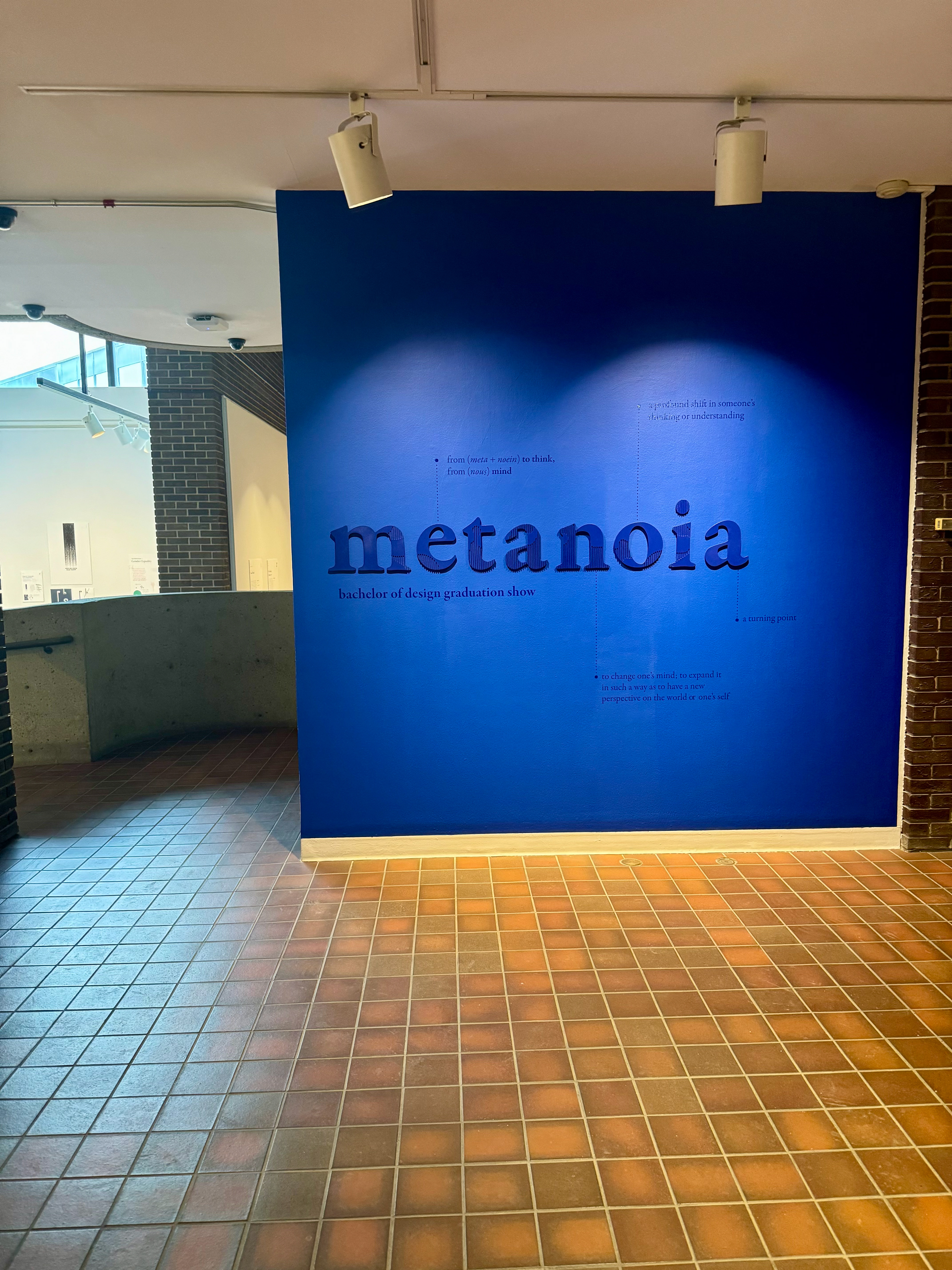
The proposed logo highlights a word that defines simplicity yet the complex shift/change in perspectives that embody the culmination of the student design journey as we enter a new beginning/chapter of our lives.
Variations
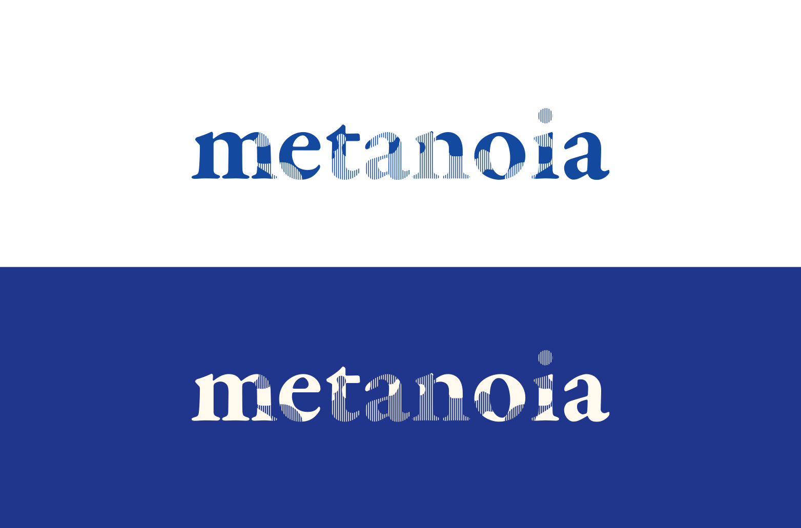
Two main variations of the logo feature the blue main identity and the off-white identity against a blue or dark background.
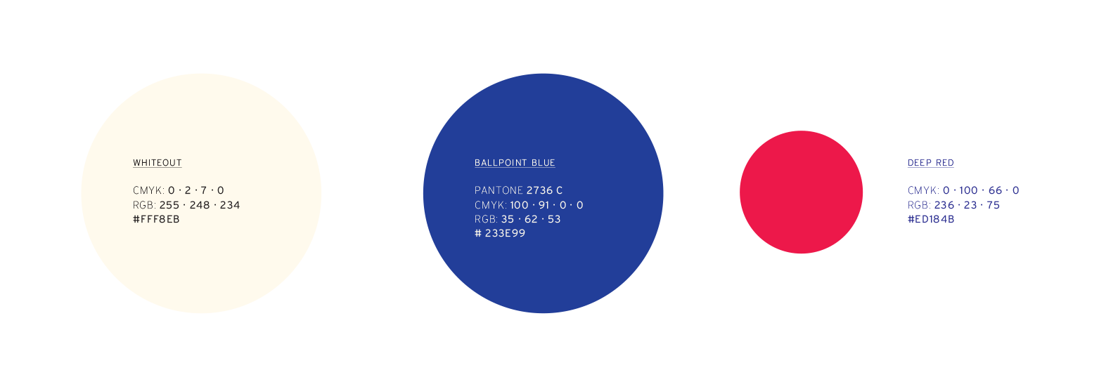
Colours
The colours utilized for the identity are composed of two main colours and an accent hue. We have chosen a vibrant ballpoint blue colour to act as a focus point on the identity, contrasting with the off-white cream to balance the palette.
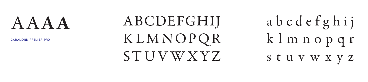
Typography
The typeface used for the identity is Garamond Premier Pro. A well-known serif font emphasizing a timelessness yet sophistication to the logo.
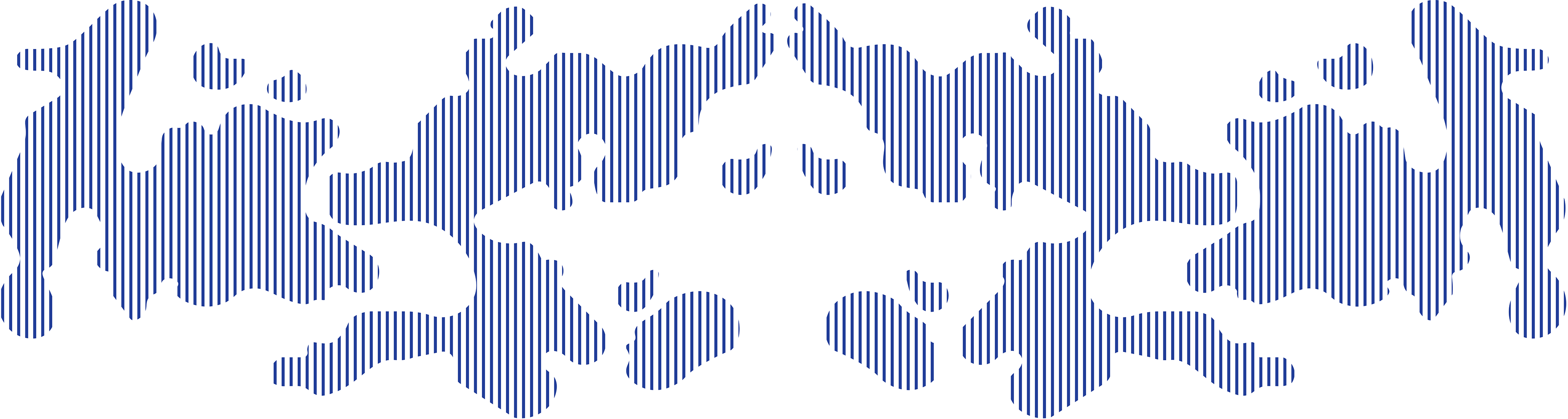
Assets
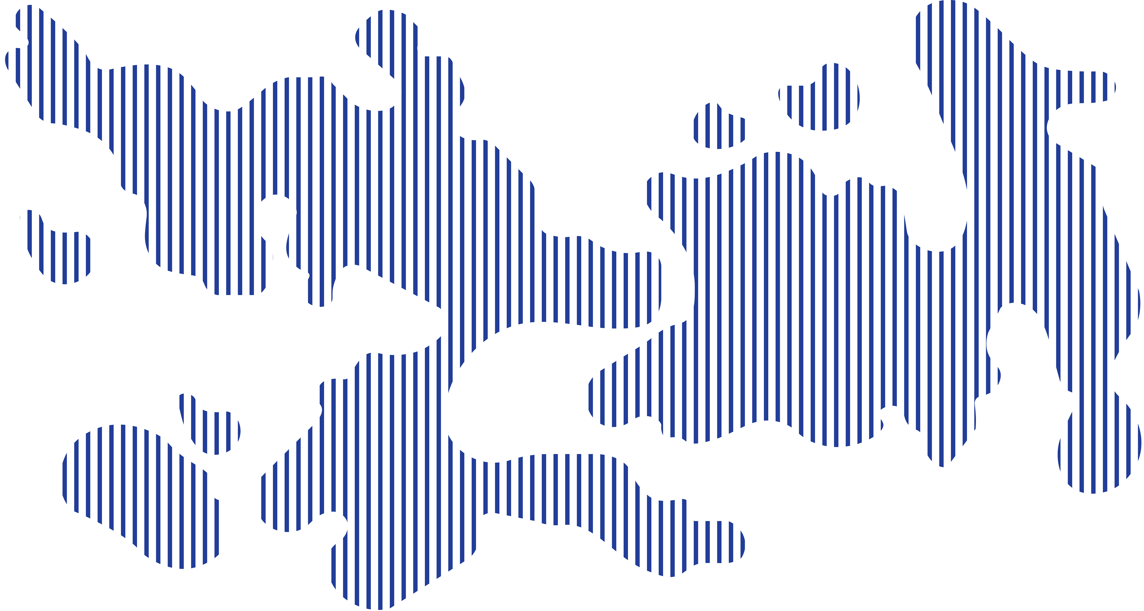
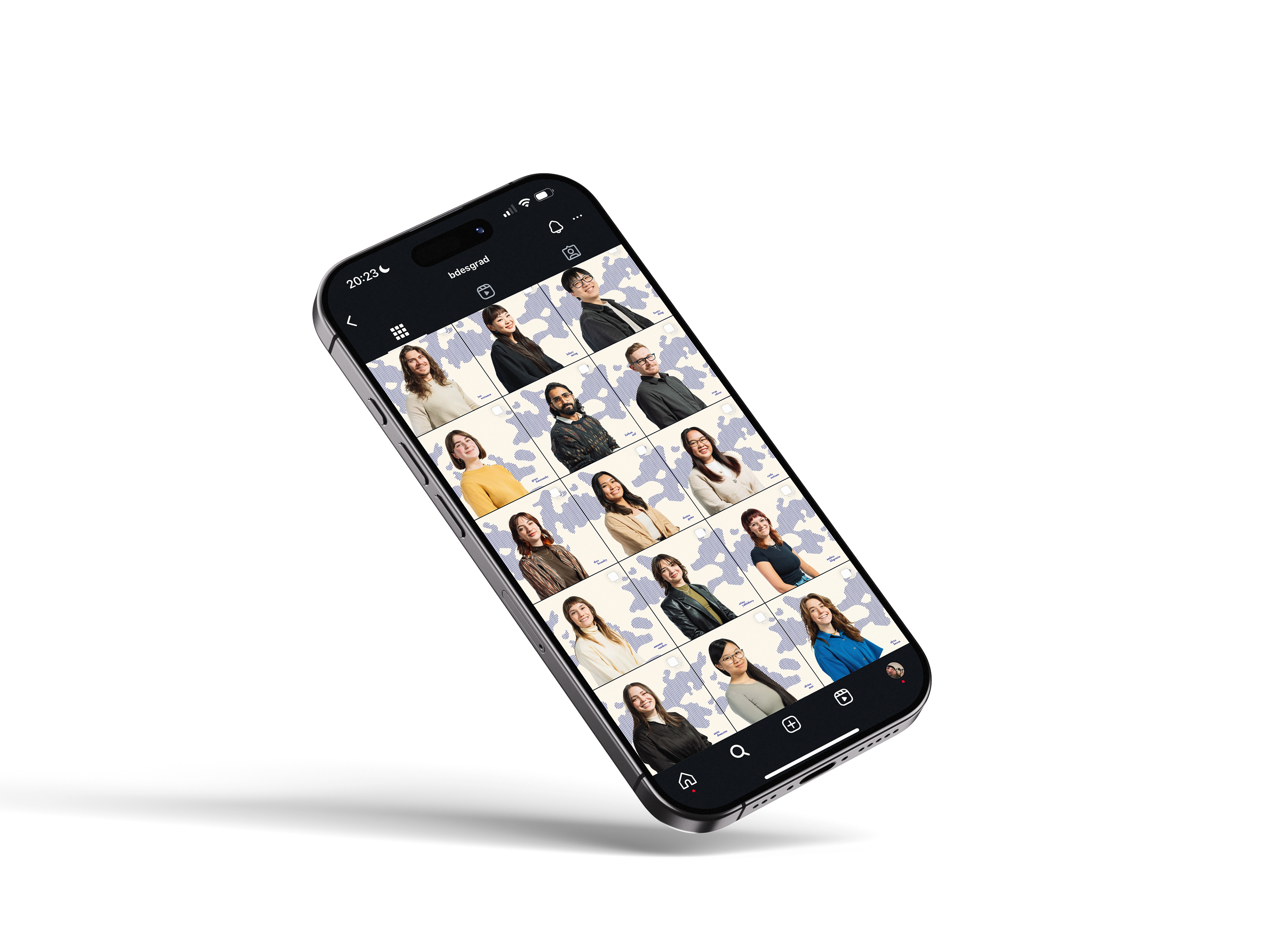
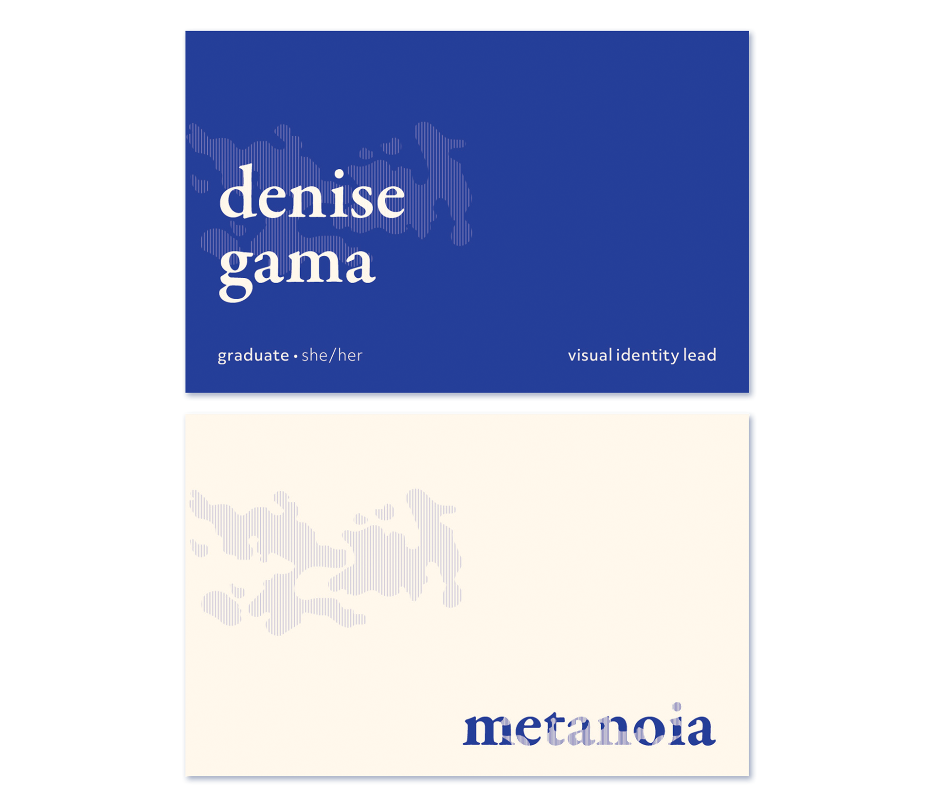
Design assets for the identity consists of the inkblots featured in: outline, stripes and in solid elements and the alphabet system. Redesigned alphabet characters, overlaid with the outlined textures, (much like the main identity) were used to attribute the design graduates' work reflecting their initial letter names (shown in the Applications section below)
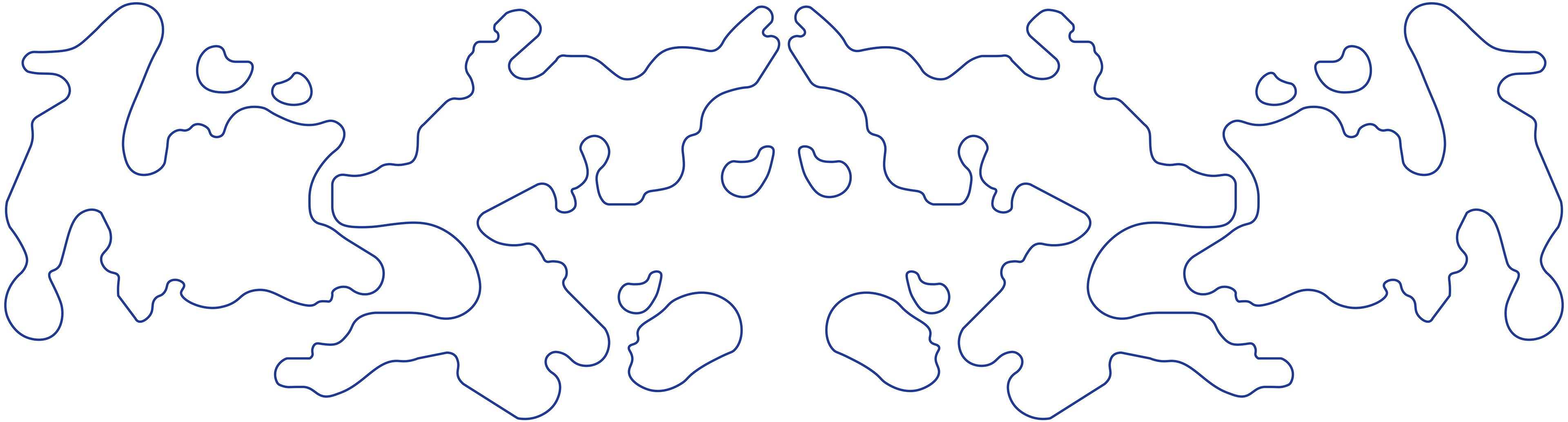
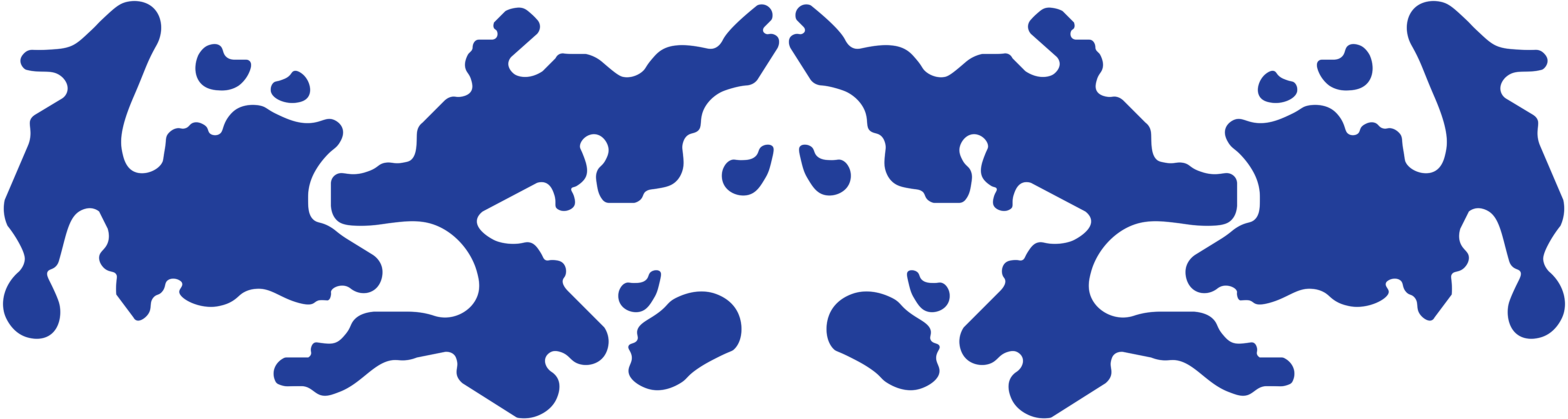
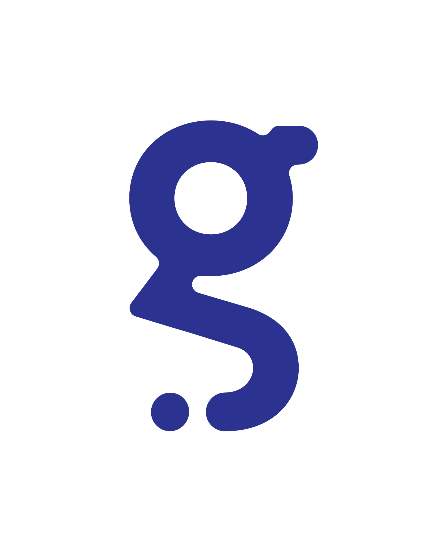
Taking inspiration from psychology and the inkblot test, incorporating the dynamic forms of the inkblot into our identity is a reflection of how perspective shapes how we see and interact with the world. Adding this against the word mark plays with how one’s perception engages with the negative and positive space which also relates to how we perceive our current journeys, our paradigm shifts, and our turning points towards our next chapters.
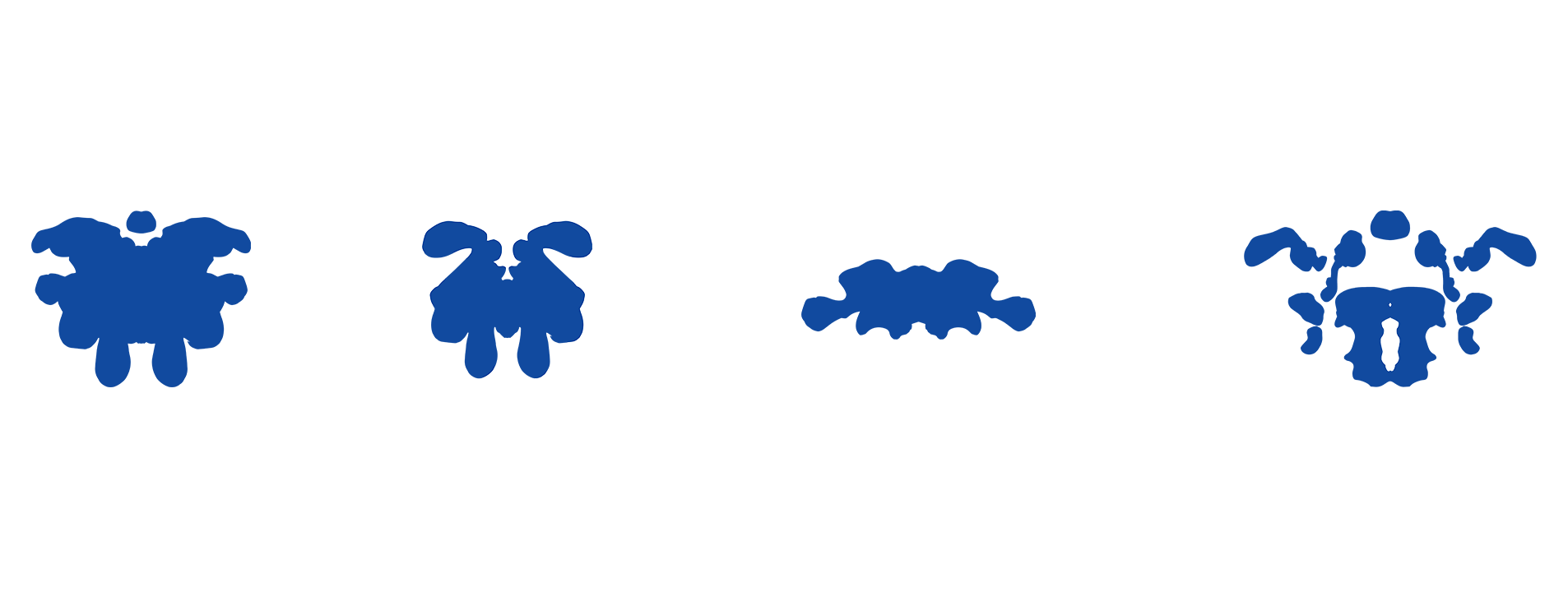
special inkblots | designed by Visual Identity Team Director (Michelle Wedel)
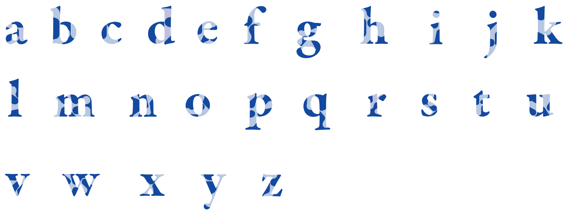
metanoia alphabet system | designed by Visual Identity Team Lead (Denise Gama)
Applications
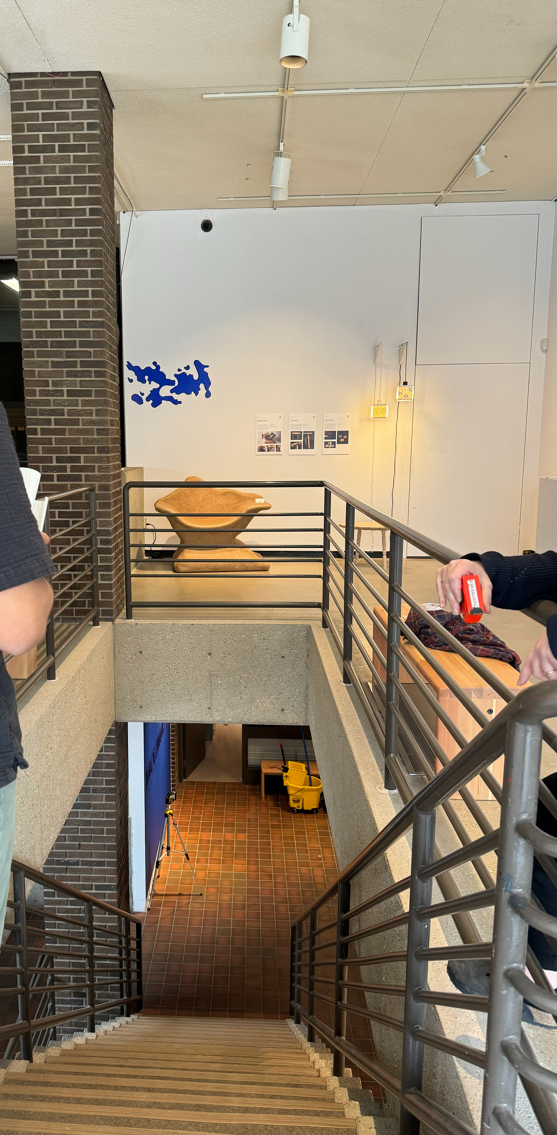
Employed in the posters to highlight designer work, gallery walls, name tags, social media, and other promotional materials, the identity assets are applied into a variety of visual platforms to display the cohesiveness of the identity system for the design graduation show.
The project was led by a large group of graduating design students that collaborated to bring forth the event. The brand represented the starting point and the axis in which the other groups within the committee followed by. I have learned the essence of communication and teamwork and being able to provide an effective guideline for other members to follow to make the promotion, gallery experience, and social media content, cohesive— that is needed in order to reflect the brand system.
Programs used: Adobe InDesign | Adobe Illustrator | Adobe Photoshop | Procreate