
Intro
The University of Alberta’s Student Union (UASU) wanted to redesign their application branding to be potentially marketed to other student associations across Canada. The aim is to reflect UASU’s goals of inclusivity, community, and the benefits that students get from points taken from quizzes and surveys.
Solution
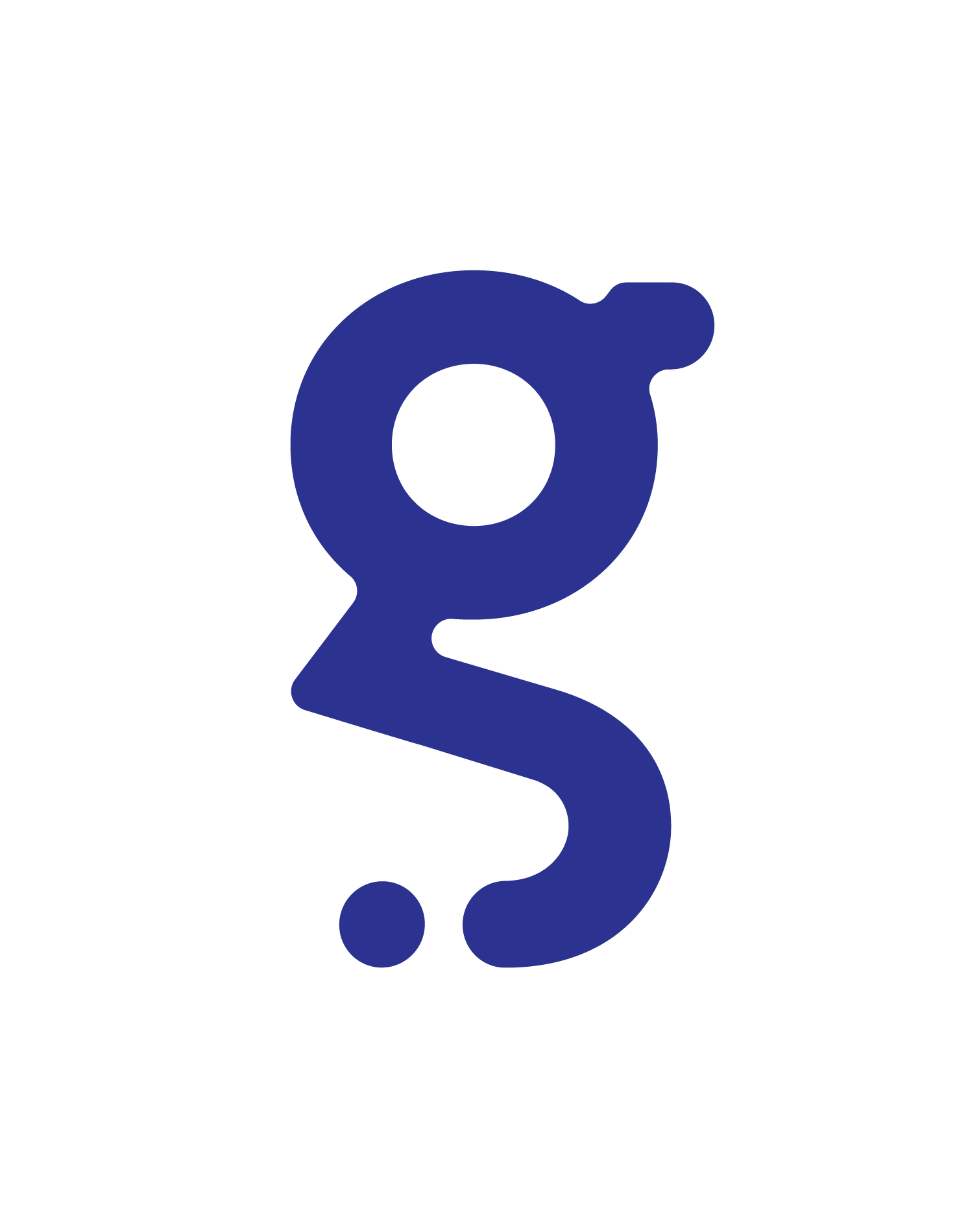
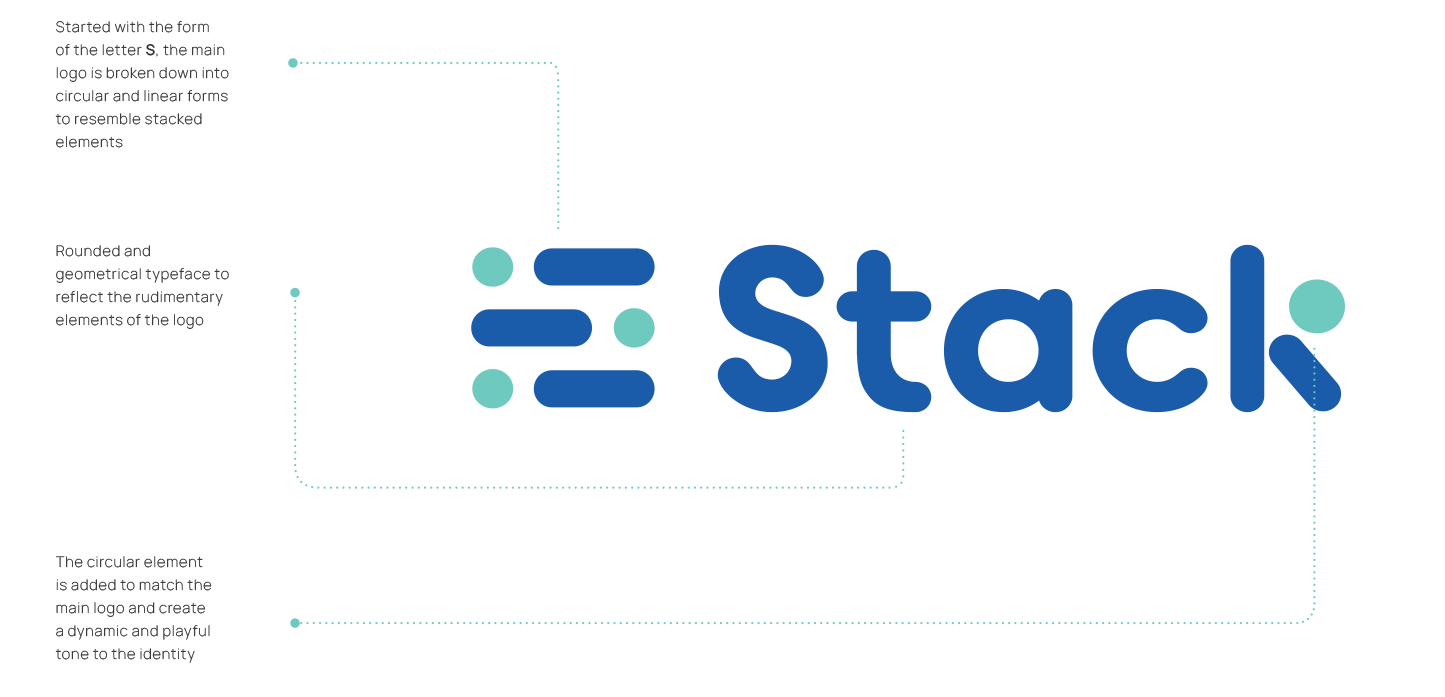
Rooted from the idea of abundance in offerings and benefits, Stack (Student Association Community Kit) was inspired from the collection of quizzes, surveys, and events the brand had originated from.
The redefined identity made use of rounded and geometric forms to create an approachable and reliable service for students to stack and reap rewards, to be informed about their school and their respective student associations, and to promote community and support within their educational institutions.
Variations
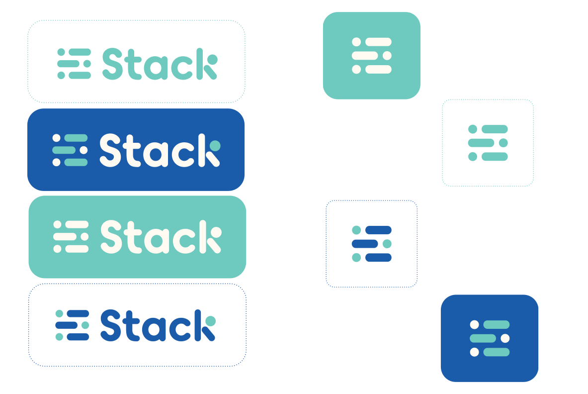
Identity variations include the main identity (stacked circles and lines with the name of the application) and the logo mark that incorporate the main blue hues taken from the colour of the logo mark itself (stacked elements).
Scale
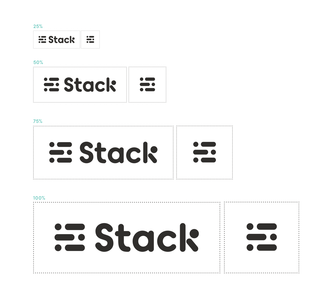
Scalability of the identity determines its legibility shown in black and white ranging from 25%—100%.
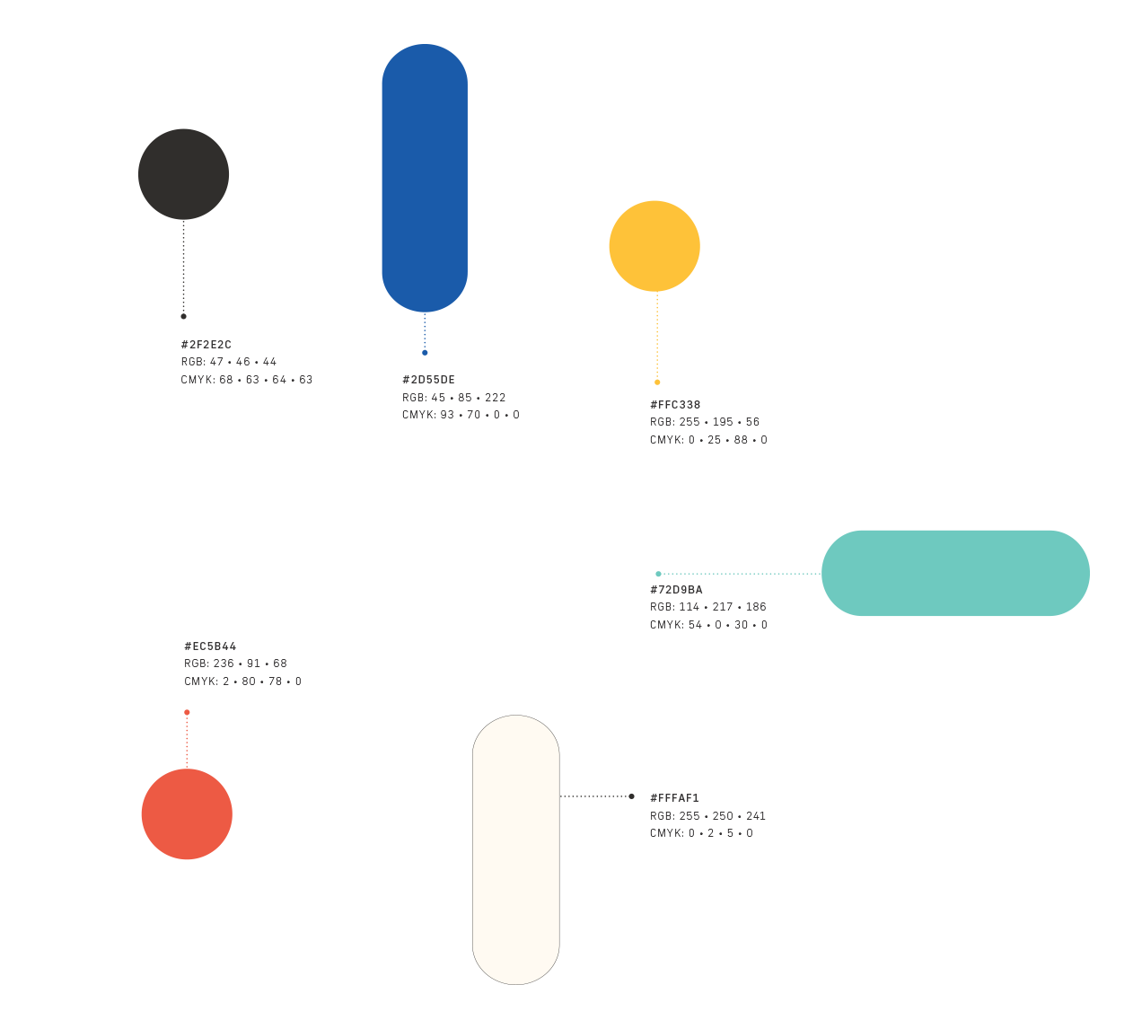
Colours
The chosen colours provide a dynamic and vibrant tone to the brand. The combination of blues and greens in the main identity highlights a playful yet intellectual feel contributing to the brand’s goal of a friendly and reliable service for users.
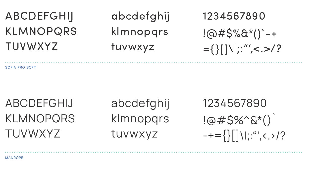
Typography
Sofia Pro Soft is the typeface used for the headings and titles in the print and mobile applications while Manrope was used as the accompanying body text for documentation and information in the UX/UI sample for the brand.
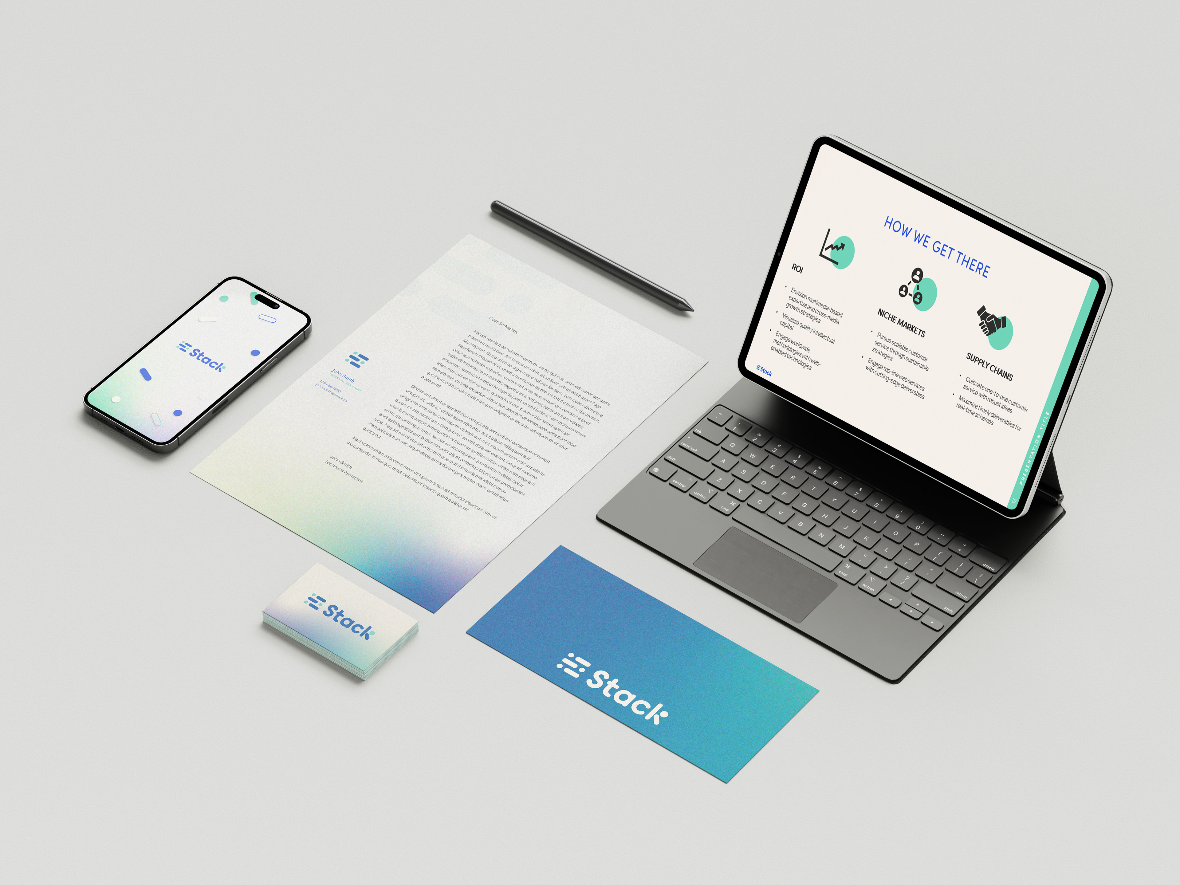
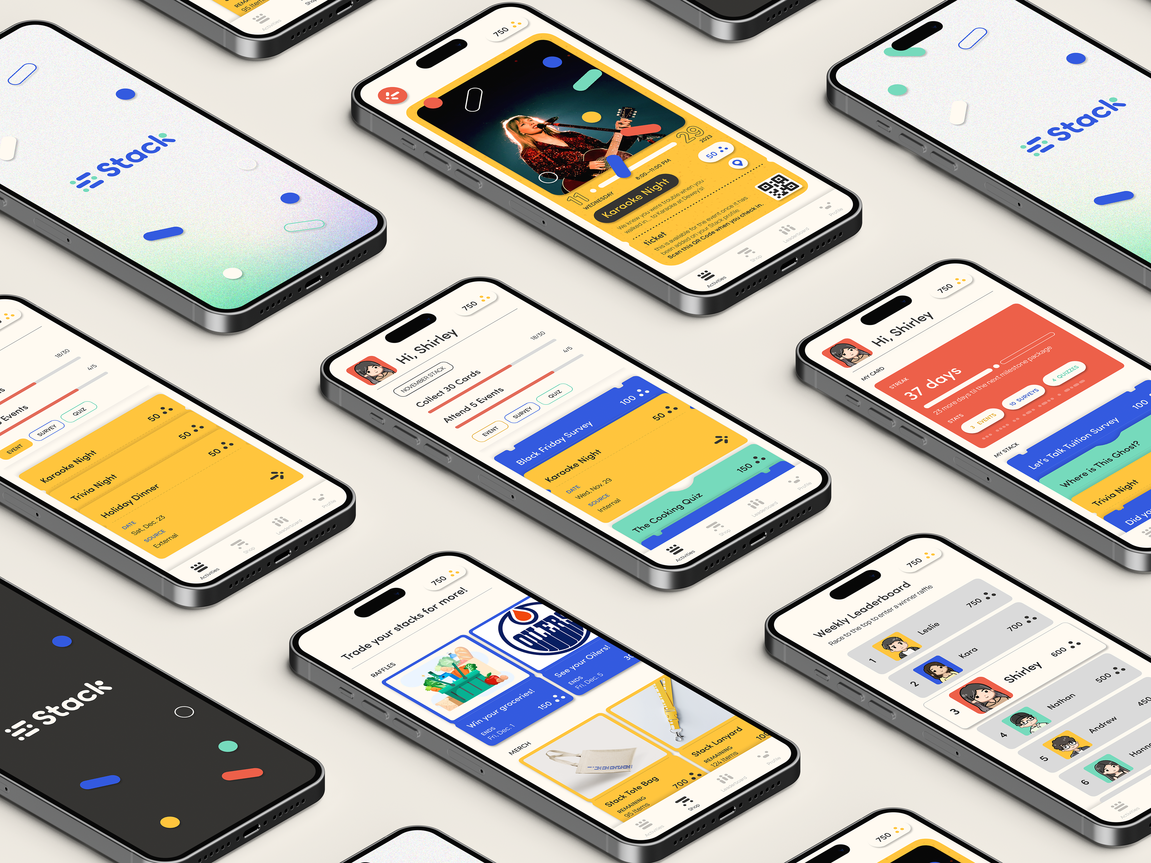
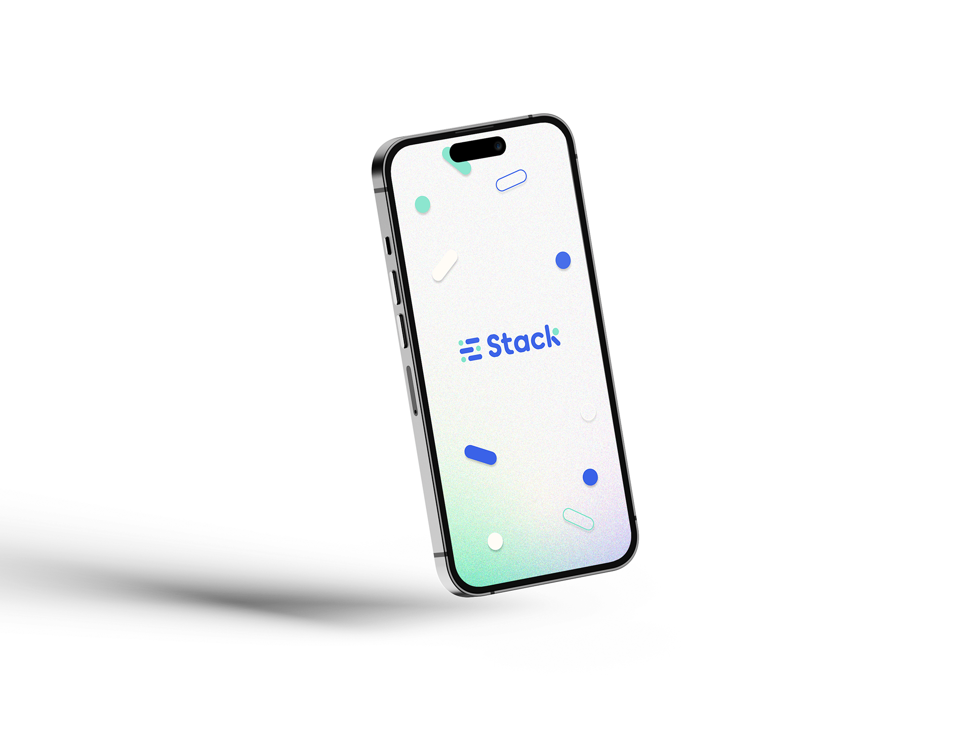
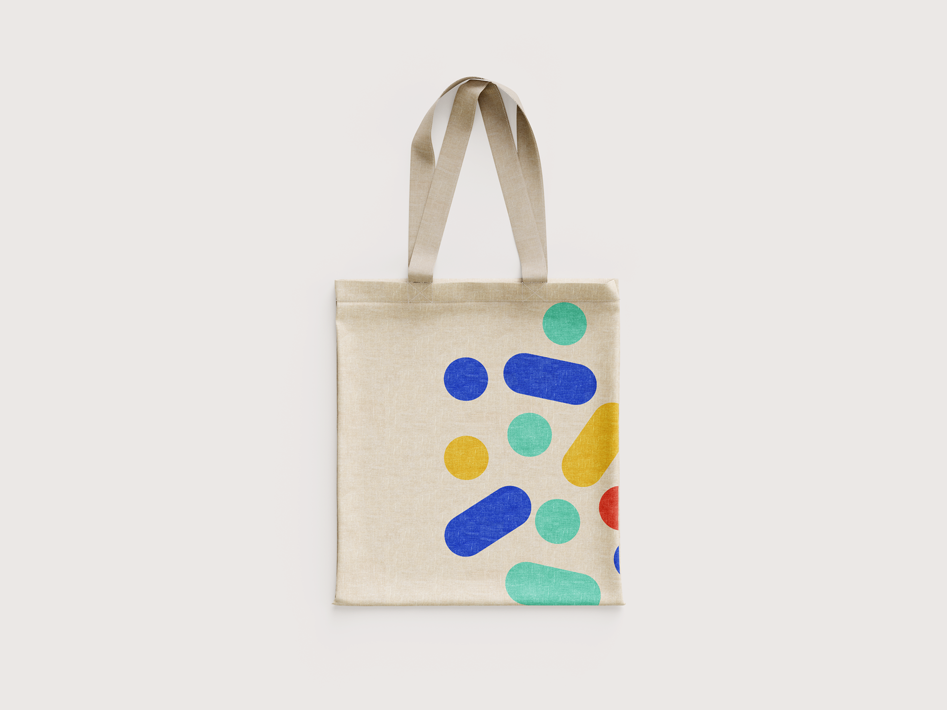
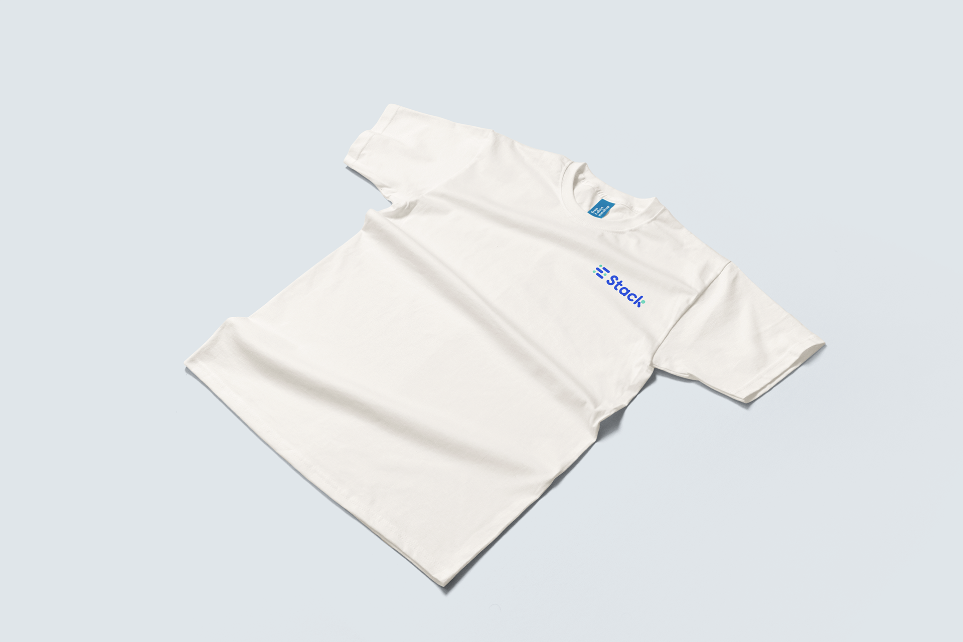
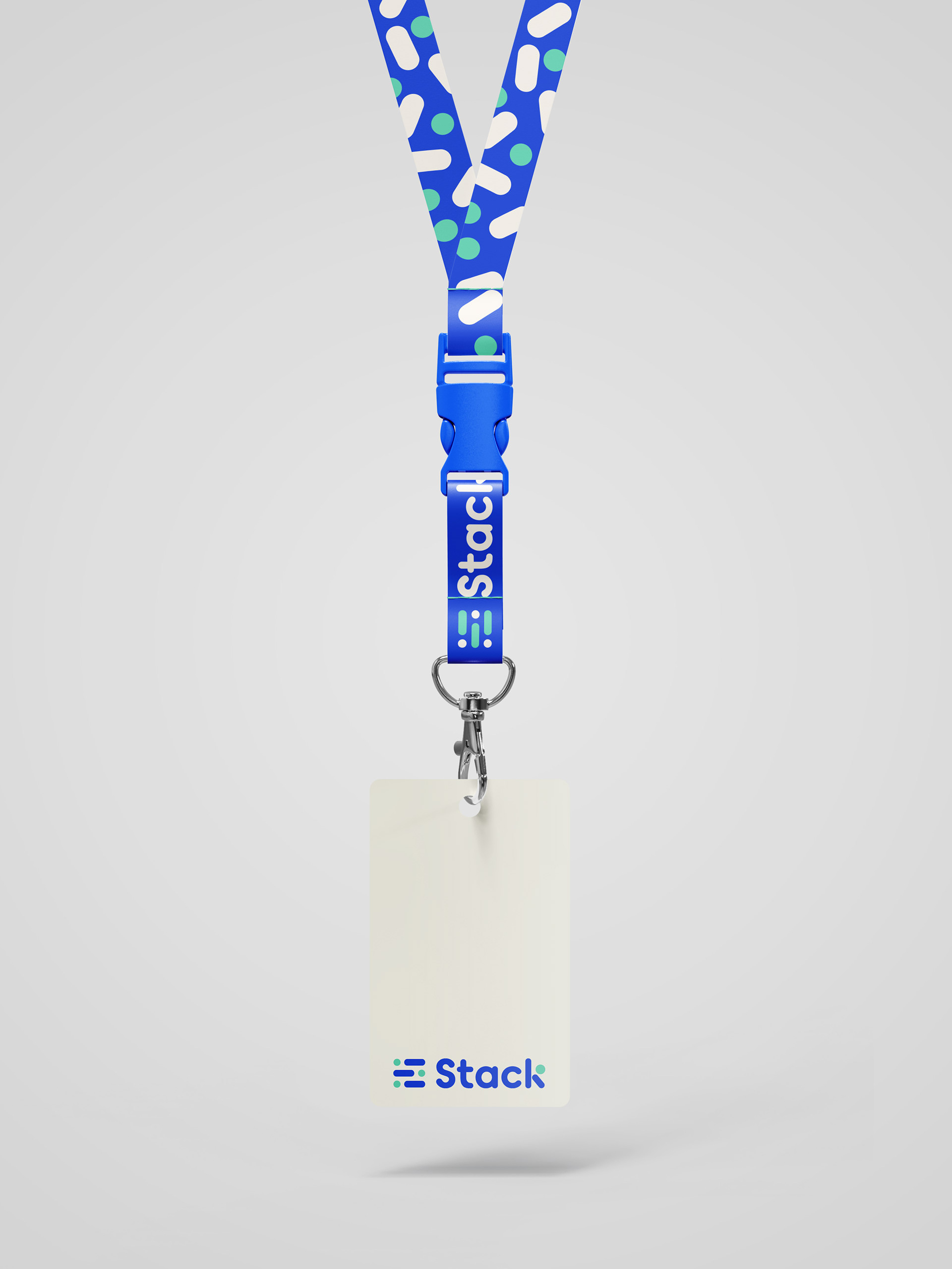
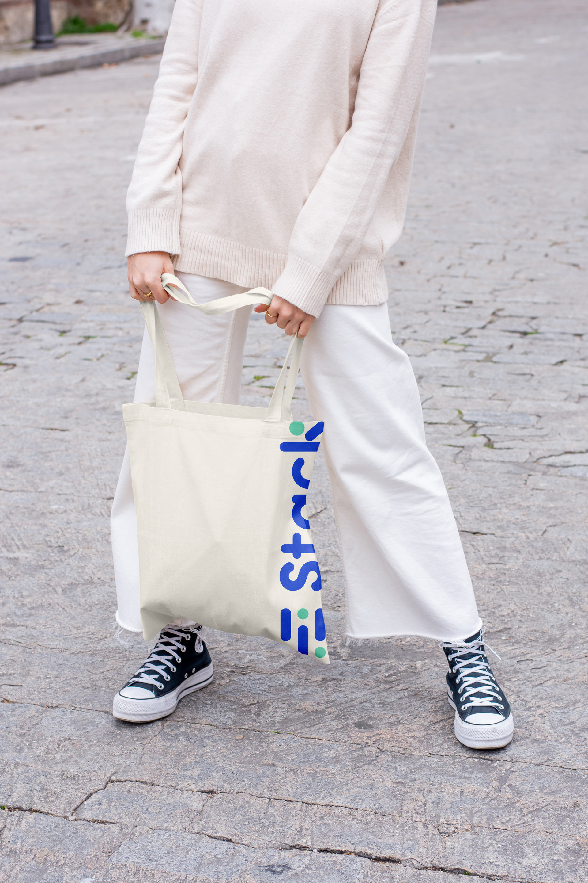
Applications
Applications of the brand: letterheads, business cards, presentation templates, UI/UX design, and merchandise are shown to have a visual on possible platforms that the brand can be integrated to as an expansion of the identity within the company for employees or how consumable or reward items (merch) will look like
The project trained me to always take into consideration the aims and goals of the project and focus on creating a cohesive brand that can be translated across different platforms. I have also learned a lot from my team member as we work through the project, we had realized certain strengths of each other that can be employed into certain aspects of the project, but also collaborated equally into what can be improved and changed.
Stack
BRAND IDENTITY GUIDELINES
Programs used: Adobe InDesign | Adobe Illustrator | Adobe Photoshop | Figma | Microsoft Powerpoint